Logo Black Logo White
  • RESUME
  • LINKEDIN
  • EMAIL
  • PROJECTS
    • IKEA
    • RPA.com
    • RPA Pride
    • RPA Newsletter
    • Acura
    • Bumble
    • Certified Pre-Owned
    • Byrd Railways
    • Eat Sleep Nerd
    • Birmingham Rugby
Menu

Birmingham Rugby

Art Direction // Brand Identity
Birmingham Rugby Club of Birmingham, AL was seeking a brand refresh. They have a magnificent program with a rich history beginning in 1967, managing a men’s, women’s, beginner, youth, and collegiate teams. They came to Bloom Studio at UAB to challenge a class of aspiring brand designers to help them create an identity to help build their online presence and connect with the surrounding community, and recruit new players.
View Project

THE
BRAND

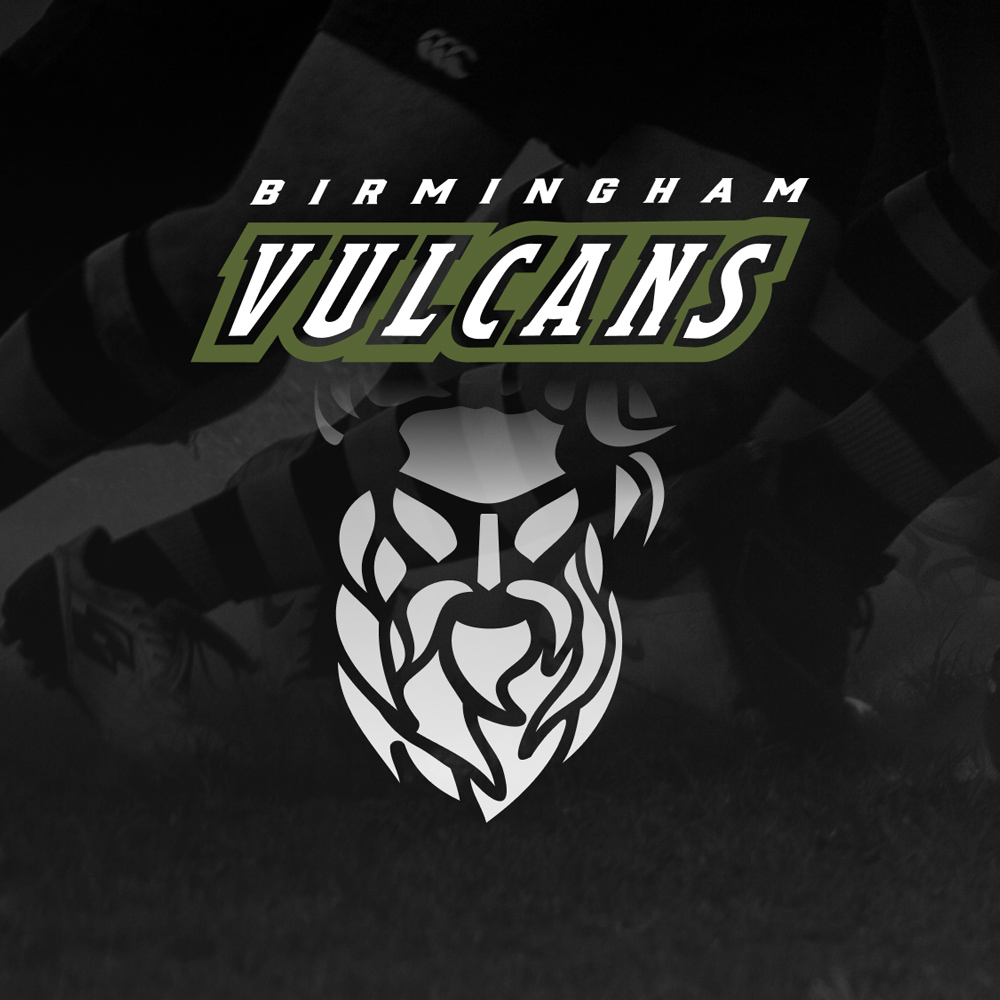
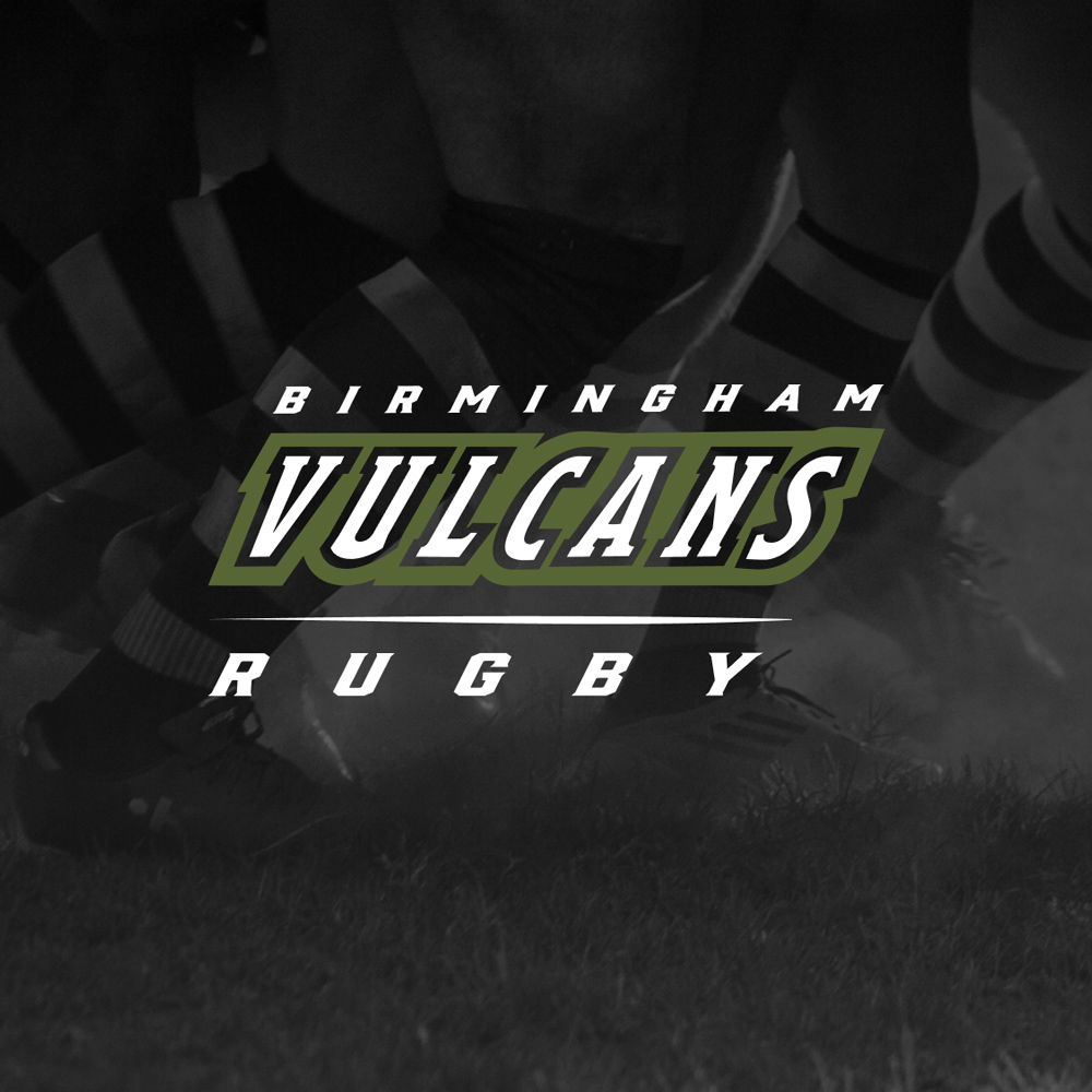
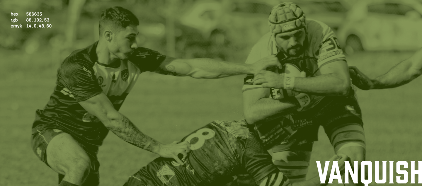
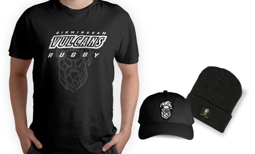
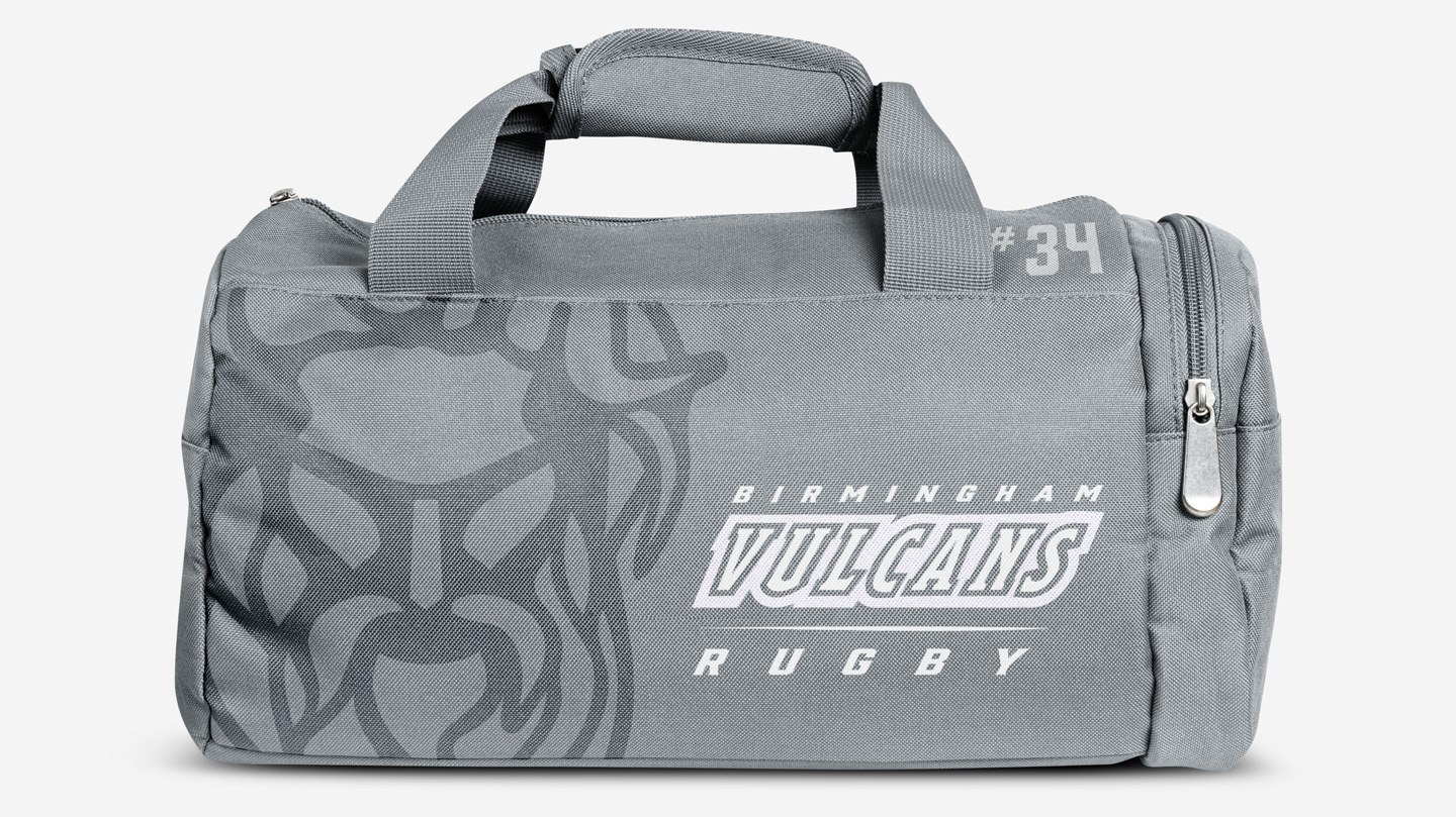
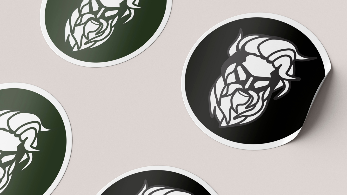
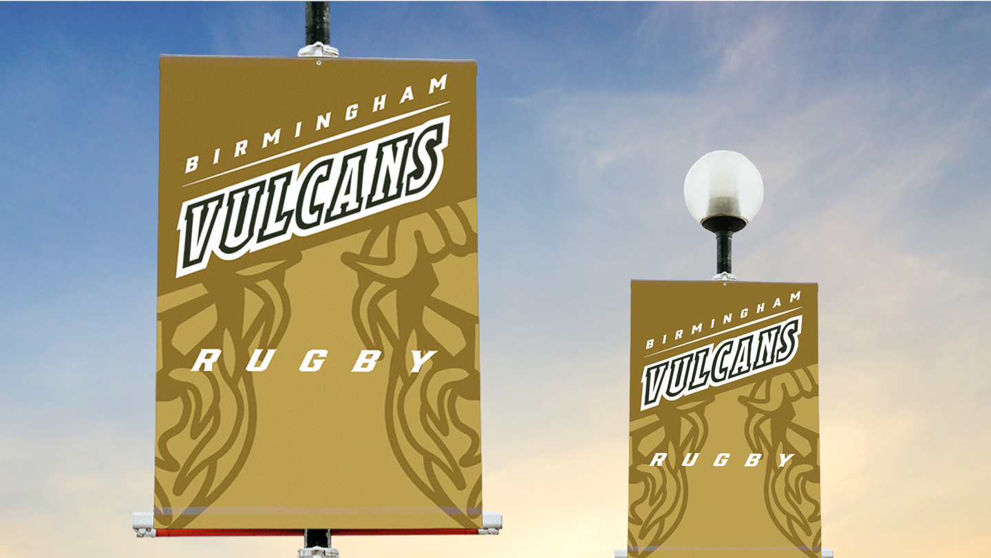
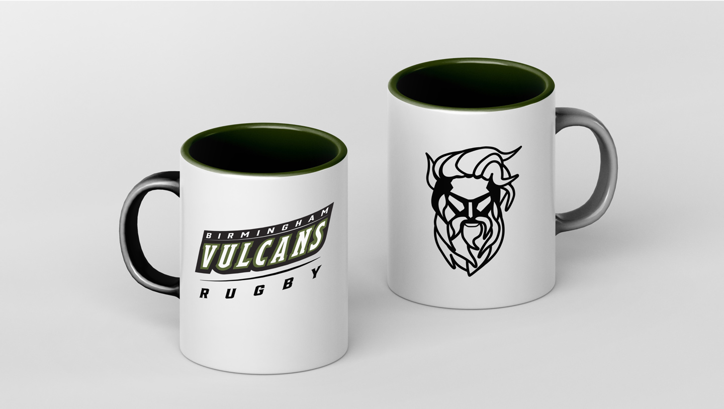
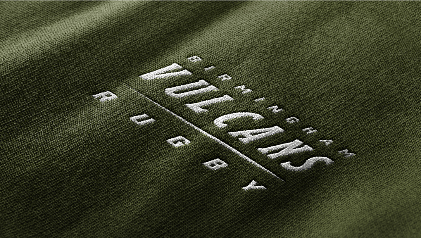
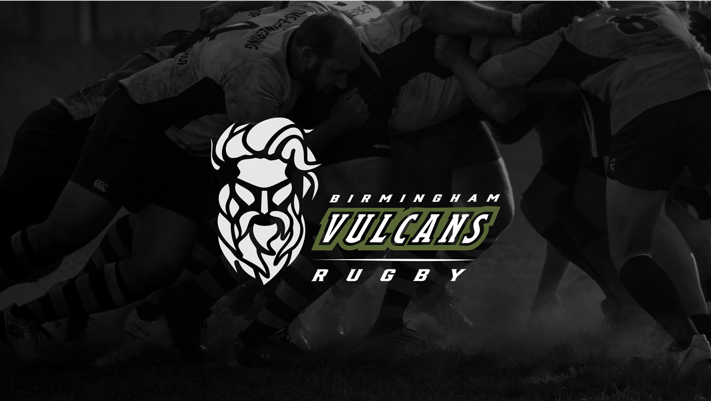
This rugby team hails from the Iron City of Birmingham, AL, where a magnificent 56 ft statue of Vulcan, god of the forge, stands atop a 124 ft pedestal has overlooked the city from Red Mountain since the 1930s. This proud symbol of the city became the team’s mascot, paired with their signature deep green their very first season in 1967.

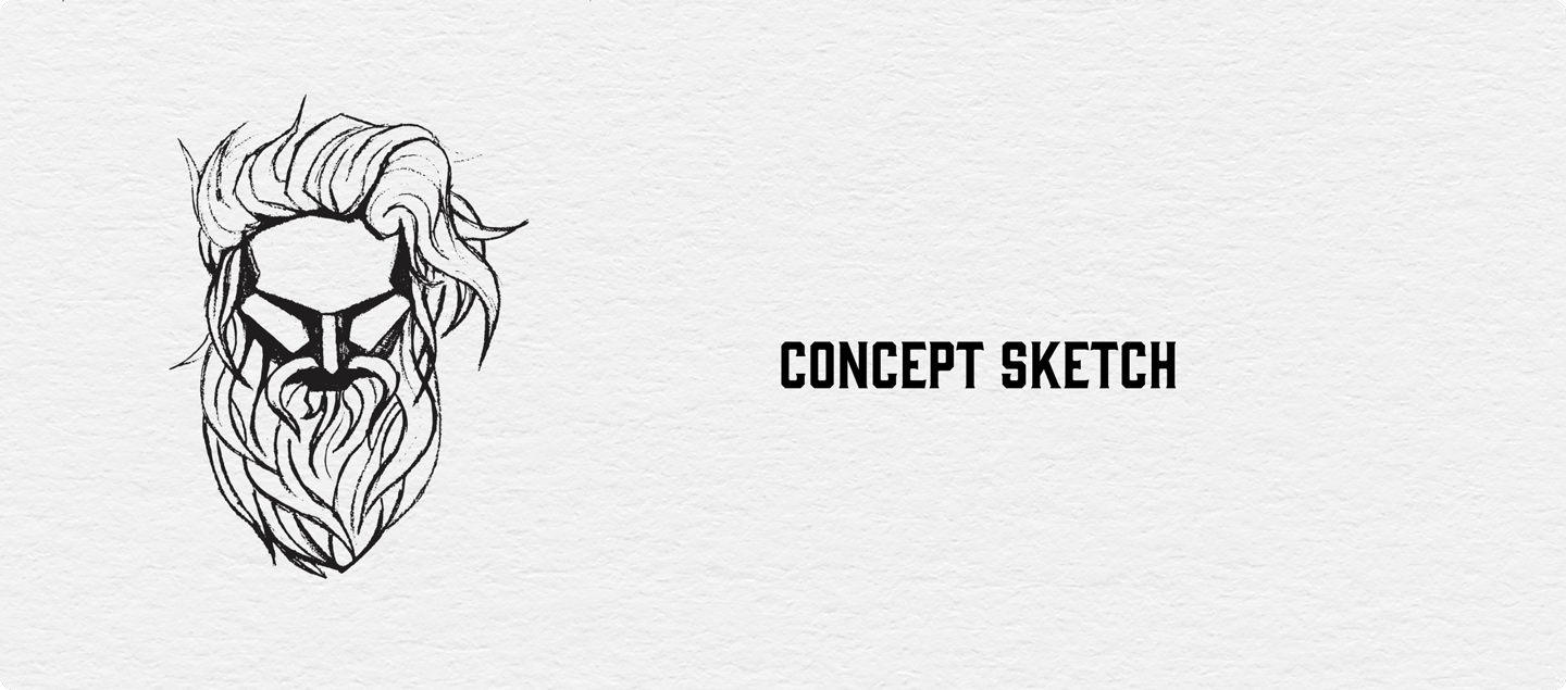
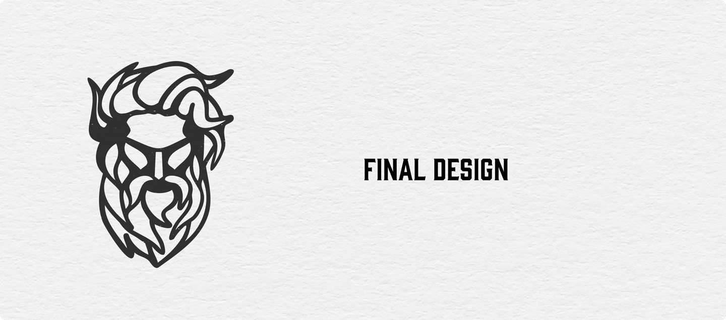
The president of the organization was clear on their intentions to keep their mascot and color, but was open to the creativity of our individual designers presenting. After approximately 20 presentations, my design was selected for the club’s future identity.

Previous
Next

COLOR

Color plays a significant role in evoking emotions and perceptions. Their primary color, Triumphant Green, relates to a balance of heart and mind. This a team that plays with enthusiasm, vigor, compassion, and togetherness. The overall combination of green, gold, and charcoal creates a sense of harmony, representing how the team values both physical strength and mental acumen, showcasing them as the well-rounded competitors they are.

TYPOGRAPHY

Timeless and classic, Gin conveys a sense of tradition and heritage, which was a perfect fit for a rugby club with a desire to establish their long history and enduring identity. This font is balanced with  modern sans-serif Proxima Nova for written materials. The contemporary and traditional elements of these fonts compliment one another, conveying both heritage and a forward-looking approach. They allow the team to communicate a message that blends the best of its historical legacy with a contemporary and competitive spirit.

0
Eat Sleep Nerd
Next Project
Back Top
2023 © Juniper Brower. All rights reserved.
Scroll Up