Certified Pre-Owned
Juniper Brower, AD/UX // Cayce Cooter, UX // Linda Sitia, Director of UX // Liz Cordingley, CD // RPA
THE
PROJECT
Acura and Honda are both American Honda Motor (AHM) companies. In order to bring more cohesion between these separately designed and developed sites for selling certified pre-owned vehicles, this customized CMS would simplify how designs could easily cater to both brand aesthetics while maintaining the same platform.
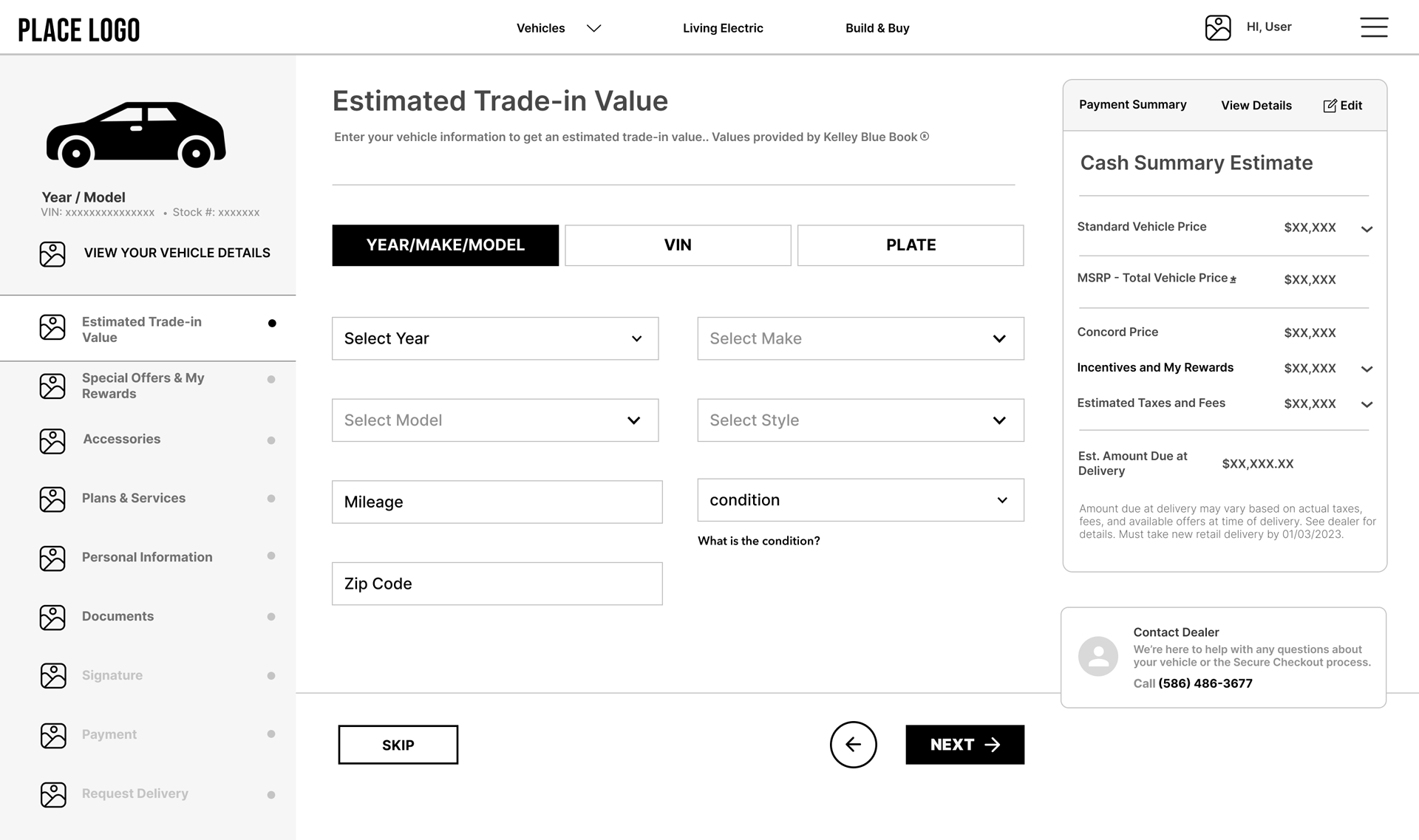
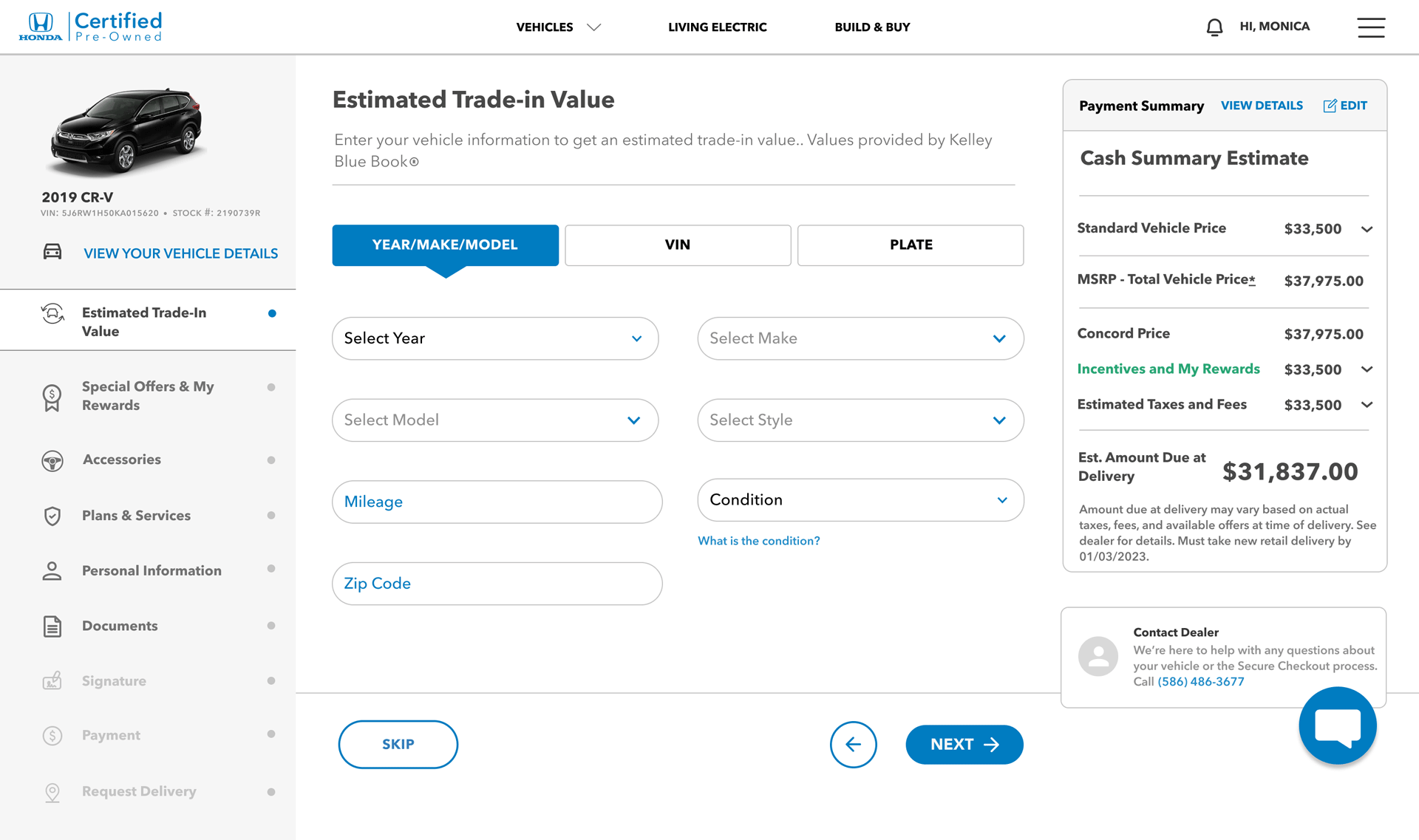
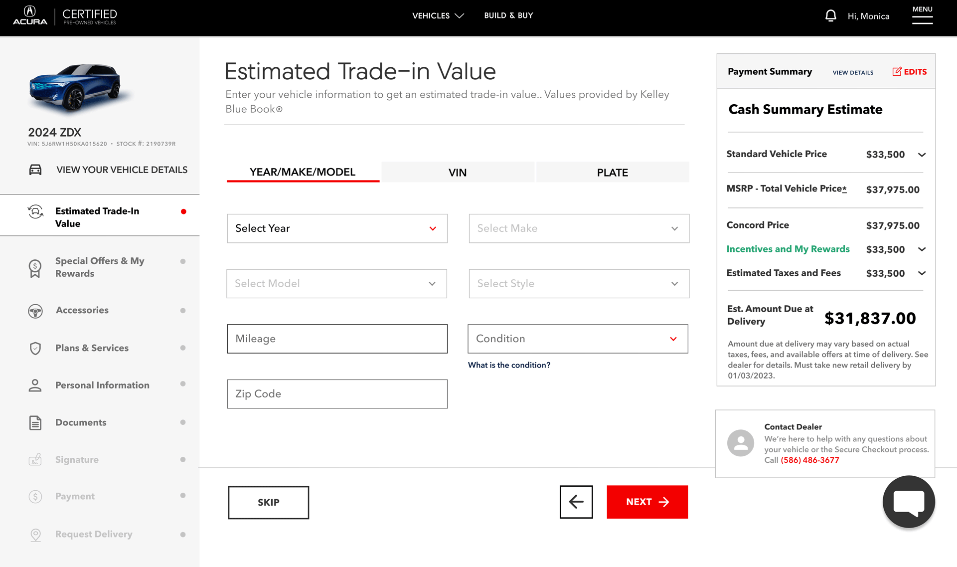
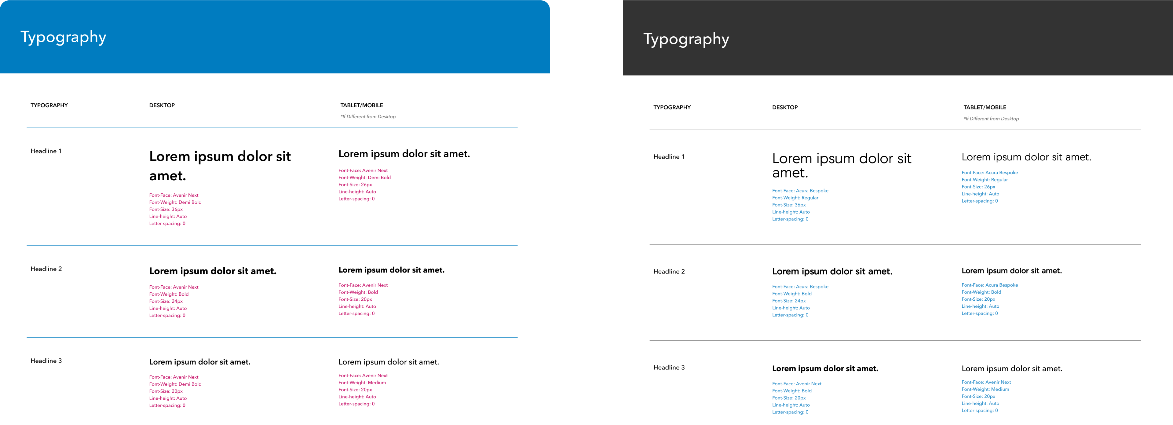
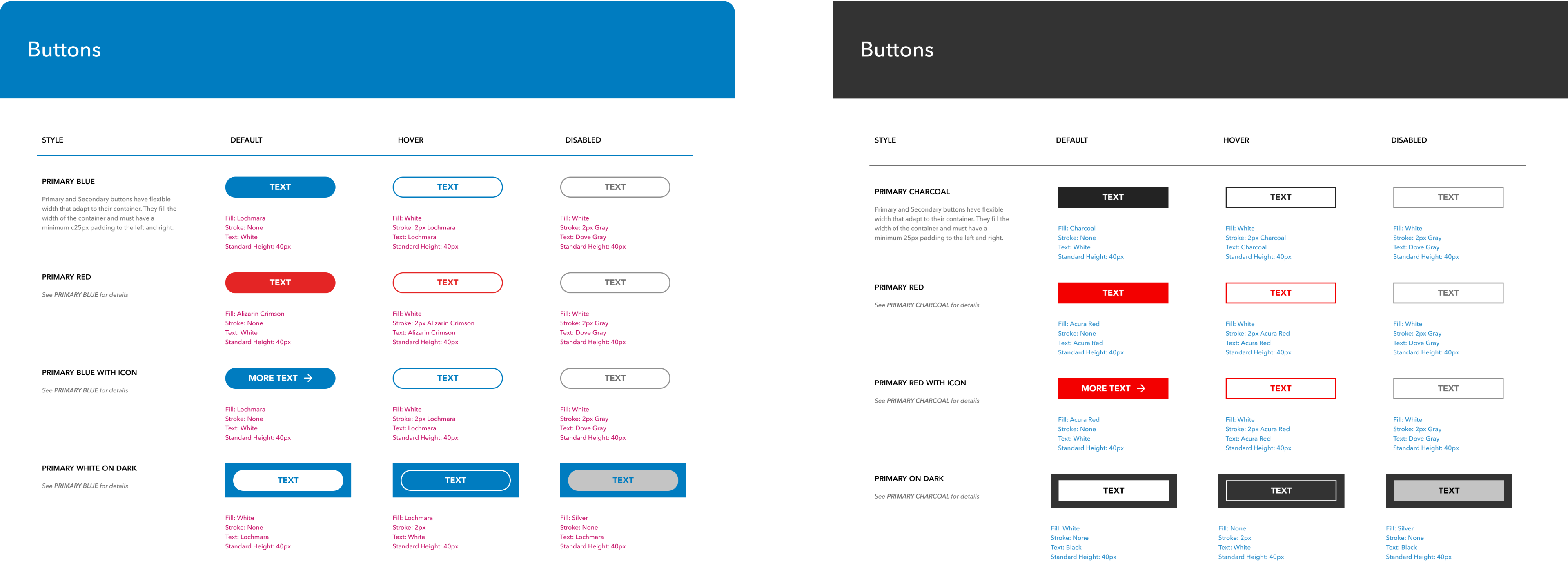
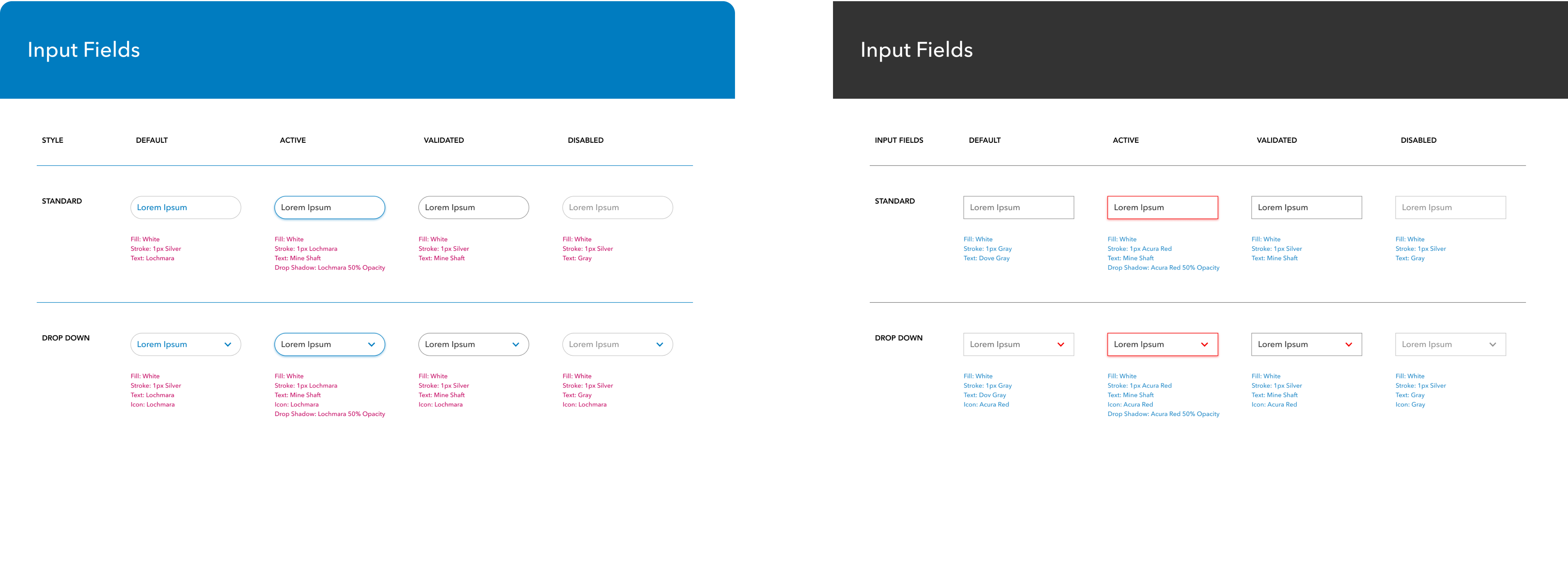
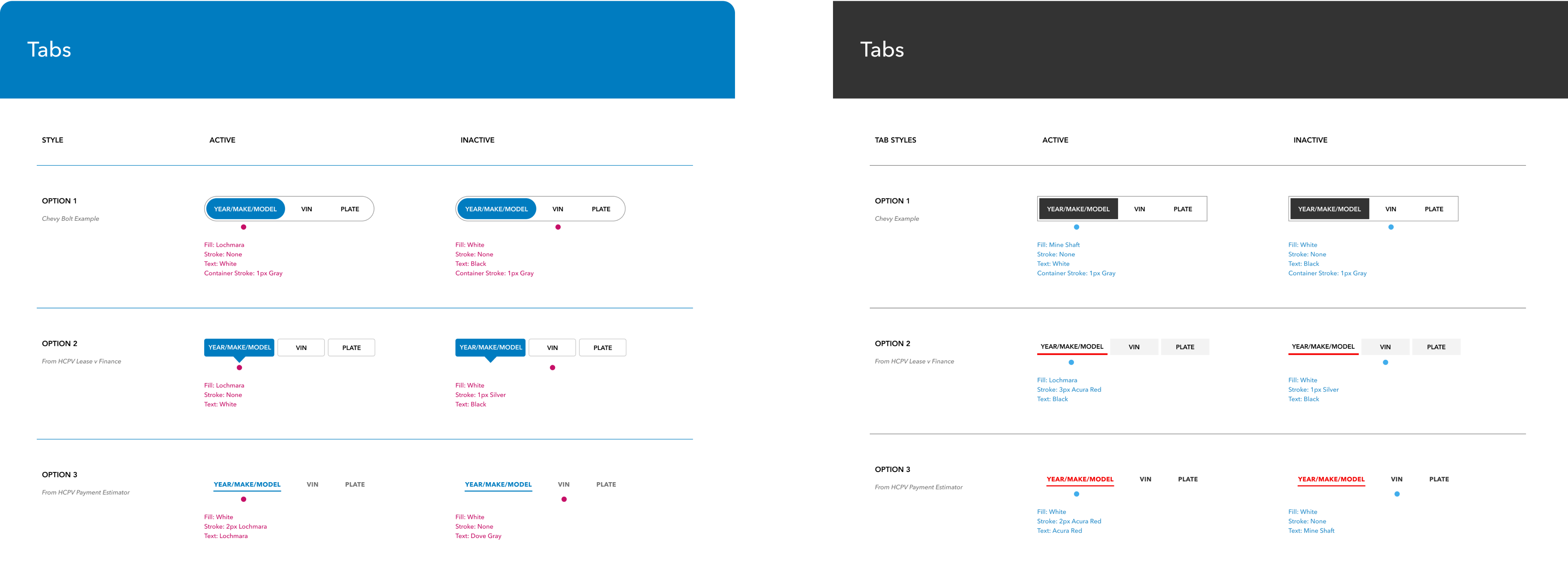
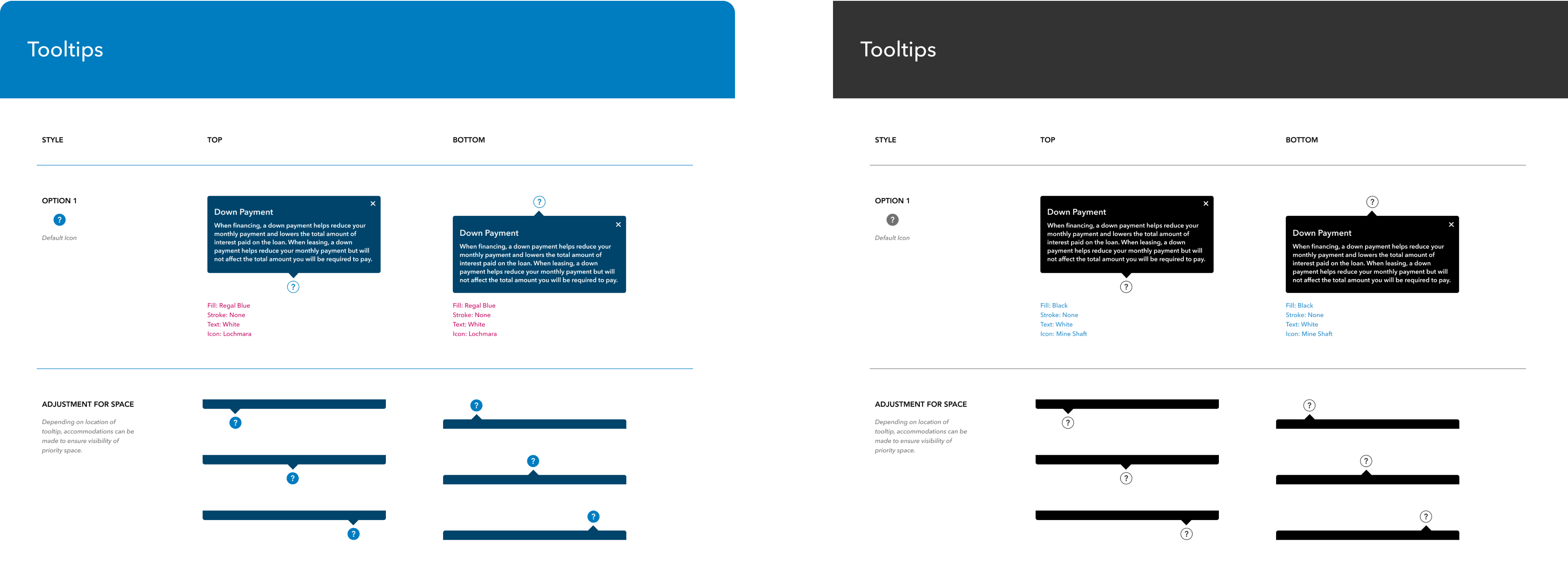
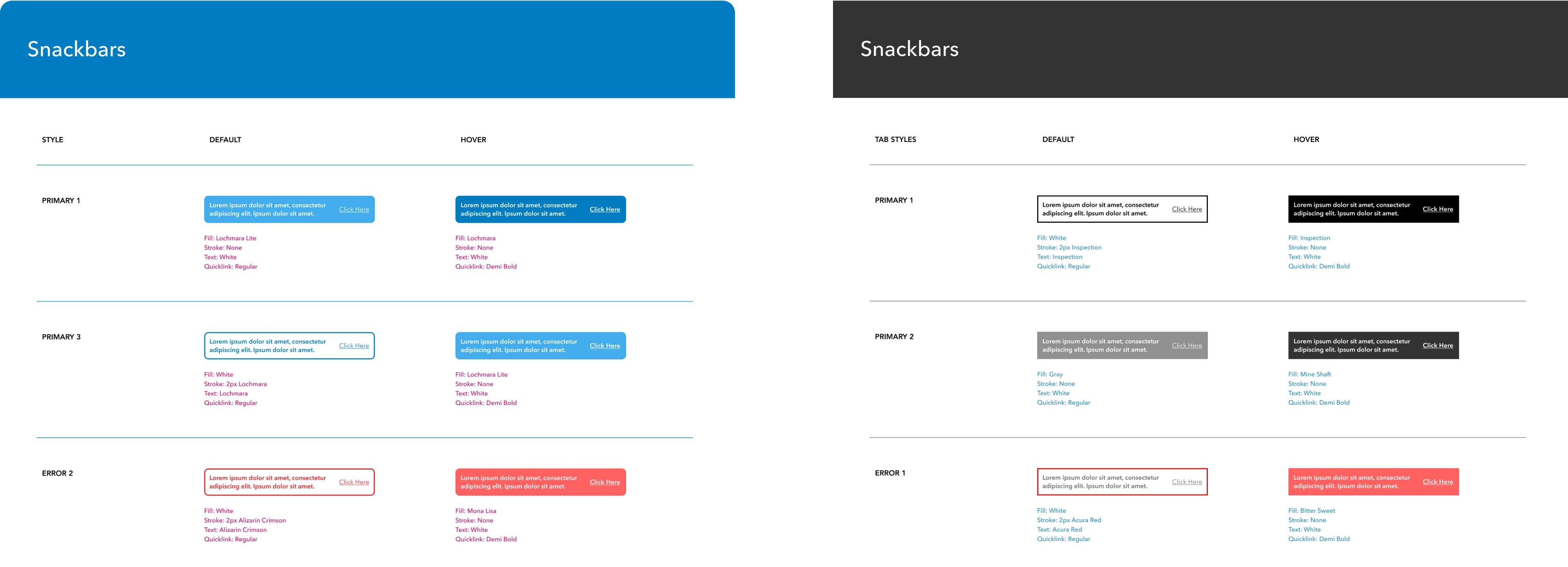
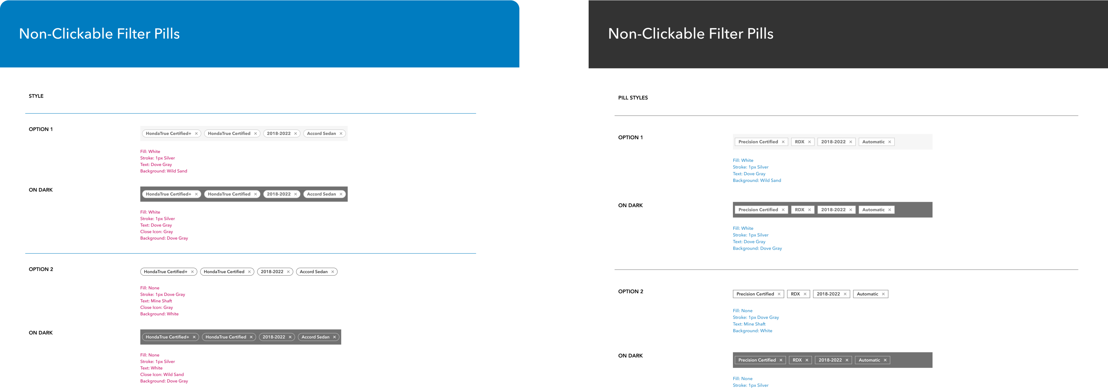
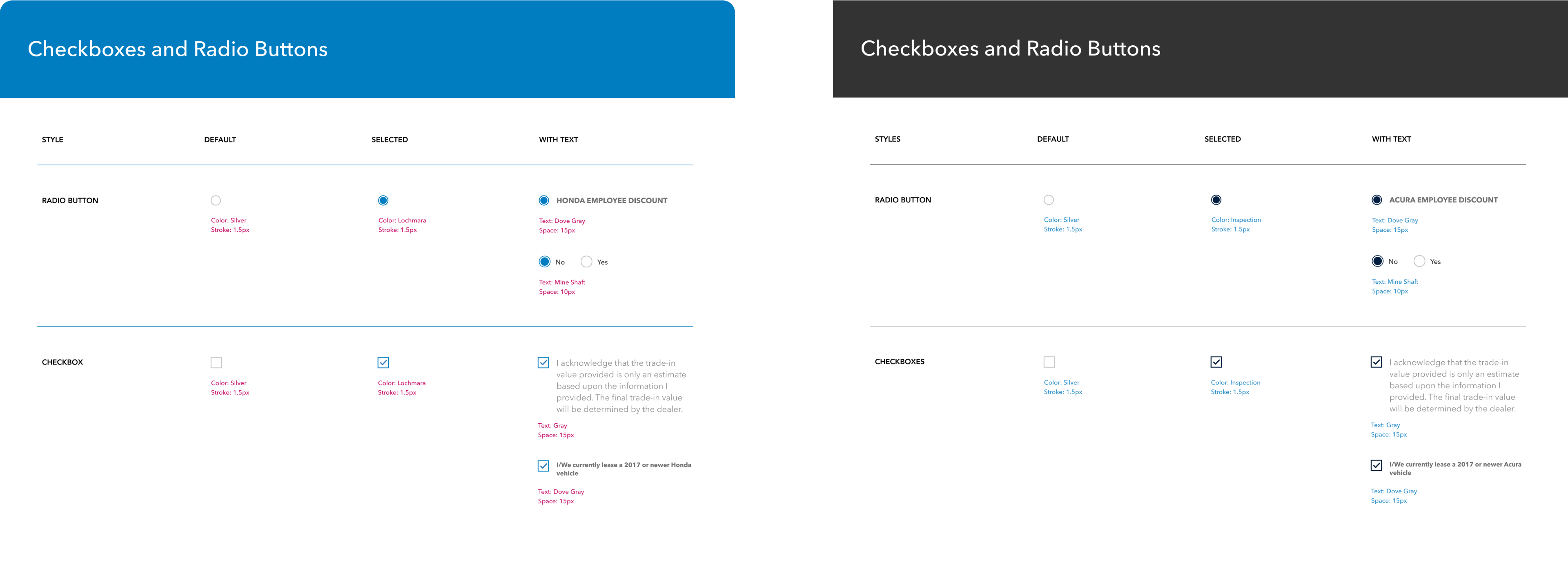
The wireframe presents a blank slate for the user interface to be modified to suit Honda or Acura. I organized and delivered a comprehensive style guide outlining each brand’s font styling and UI elements with contextual examples of how to implement the design.
Design
Systems
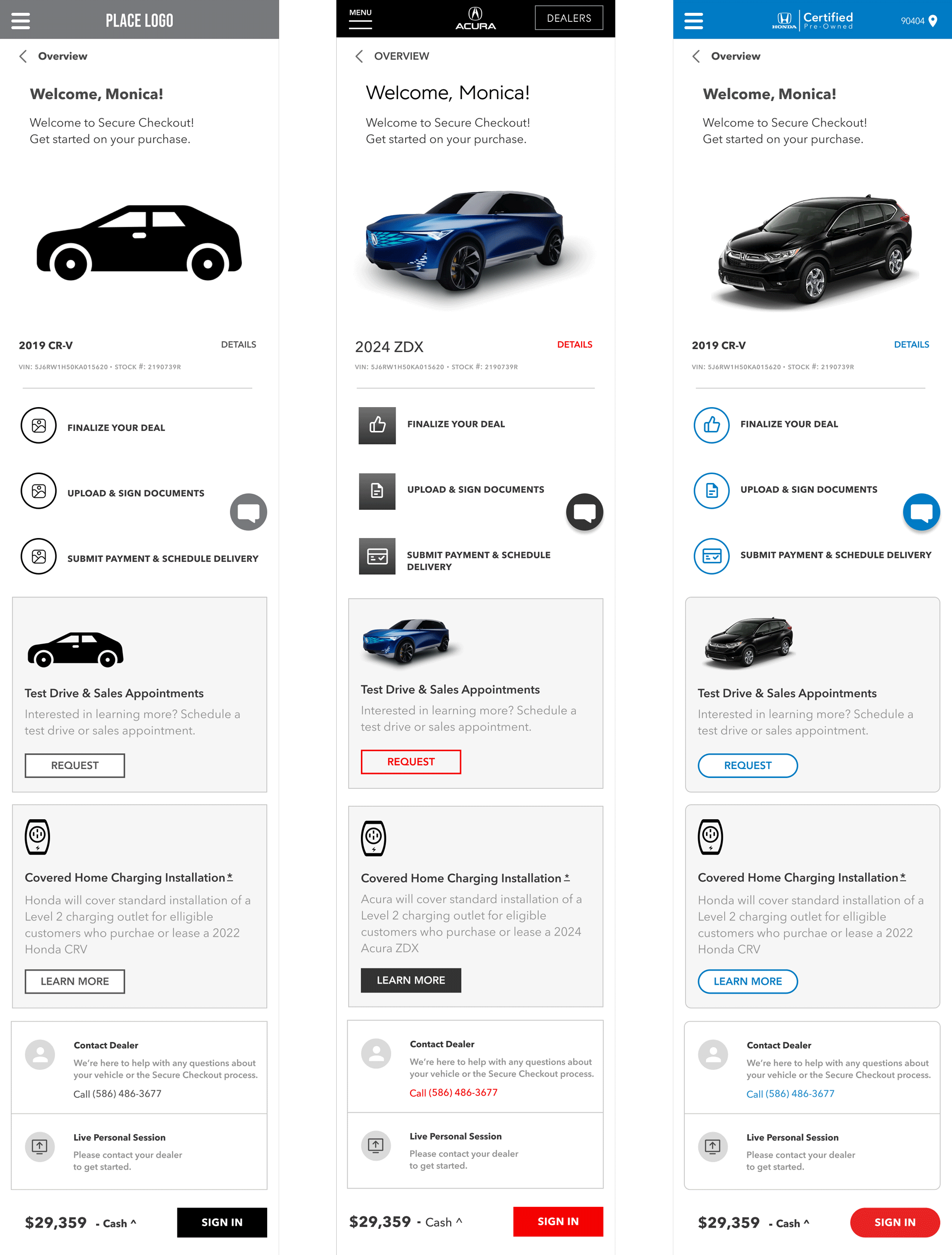
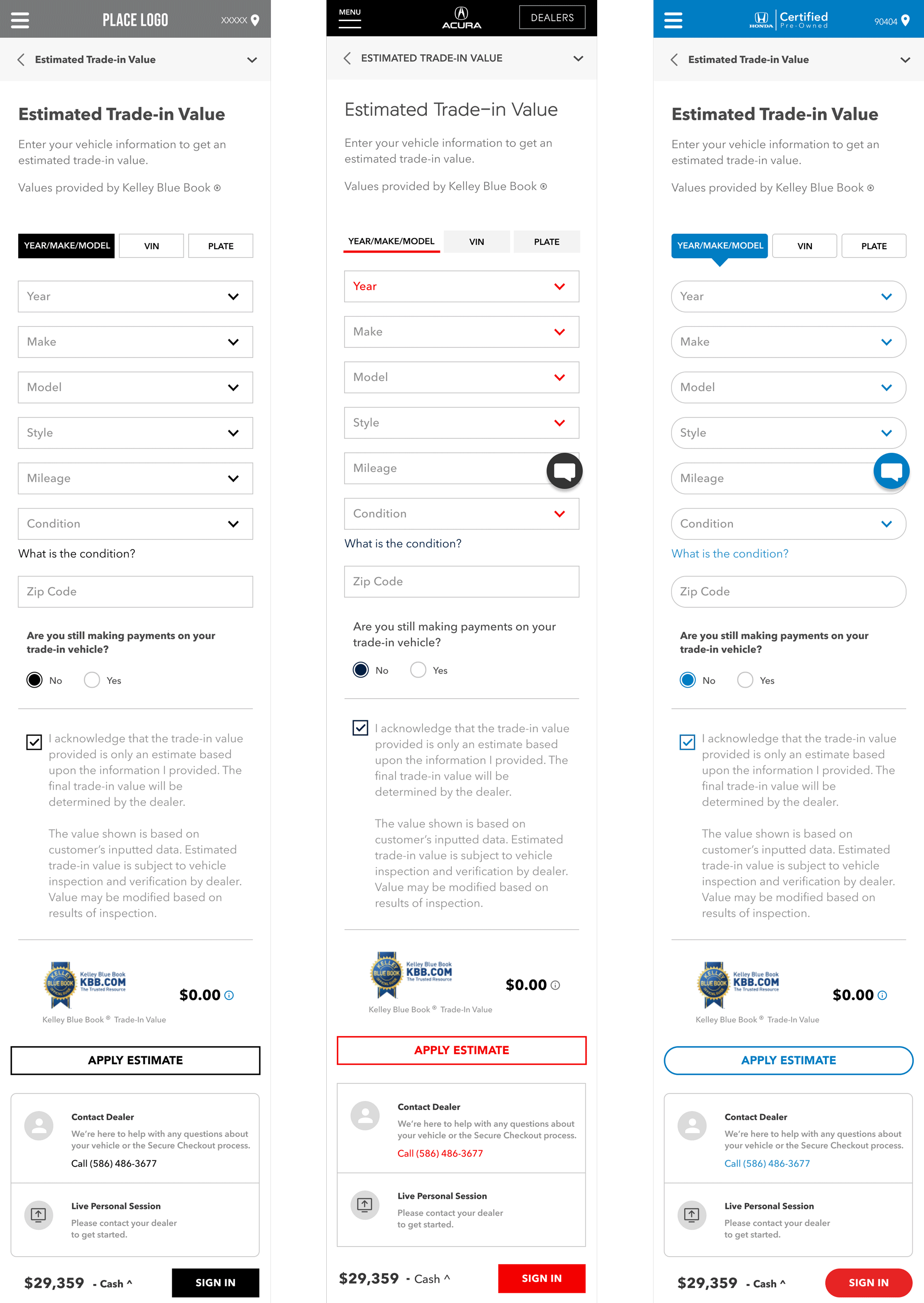
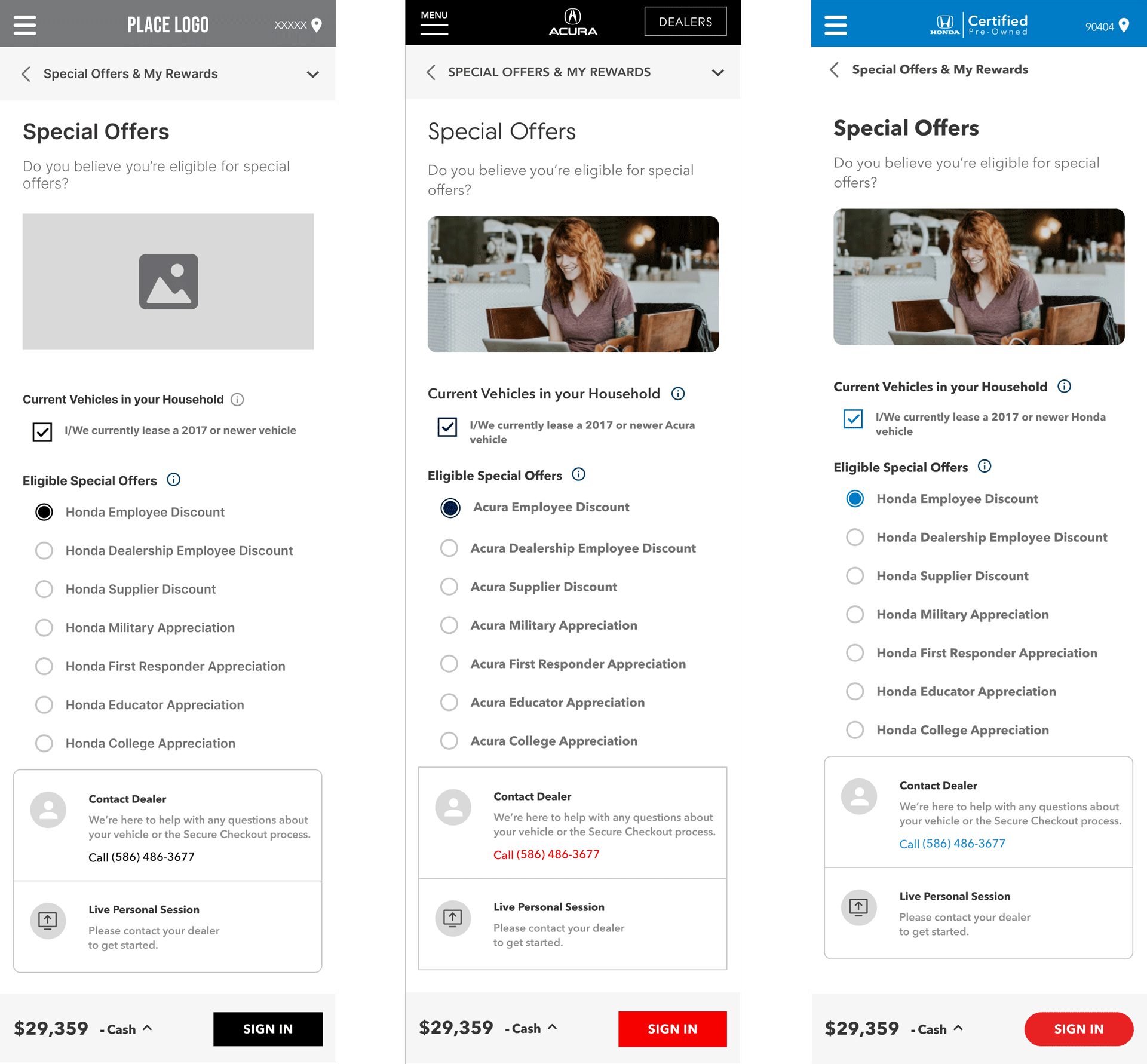
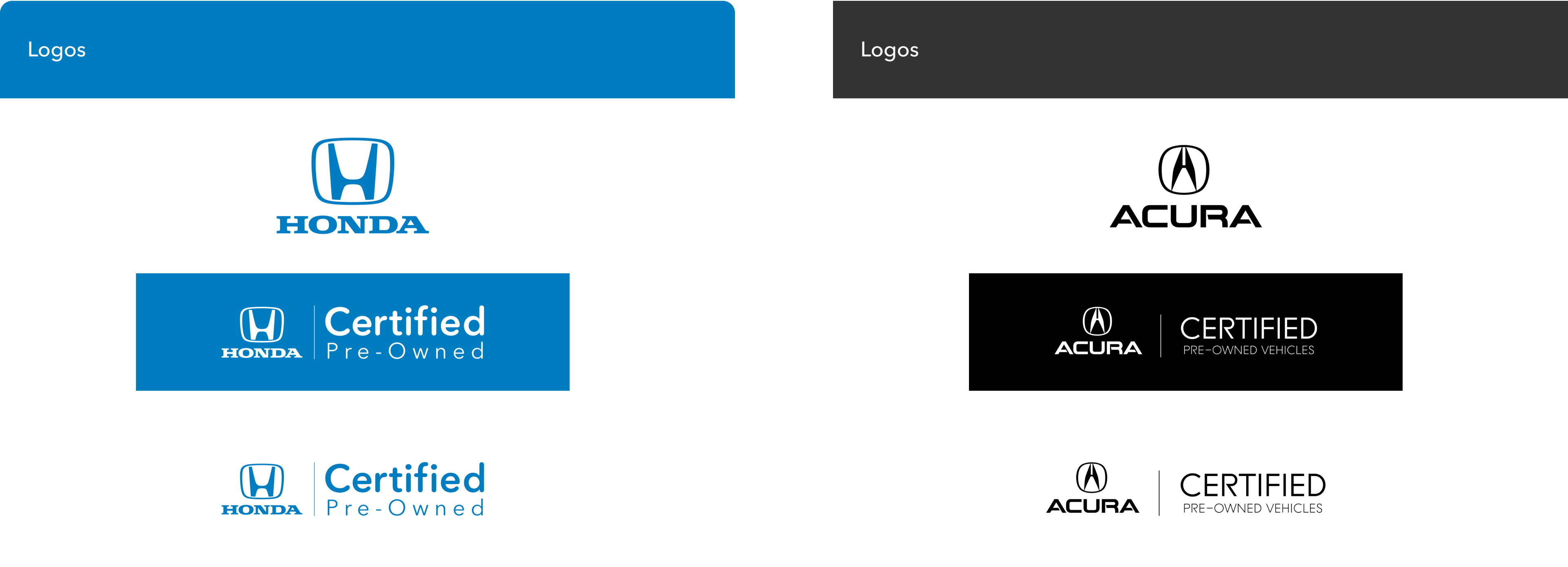
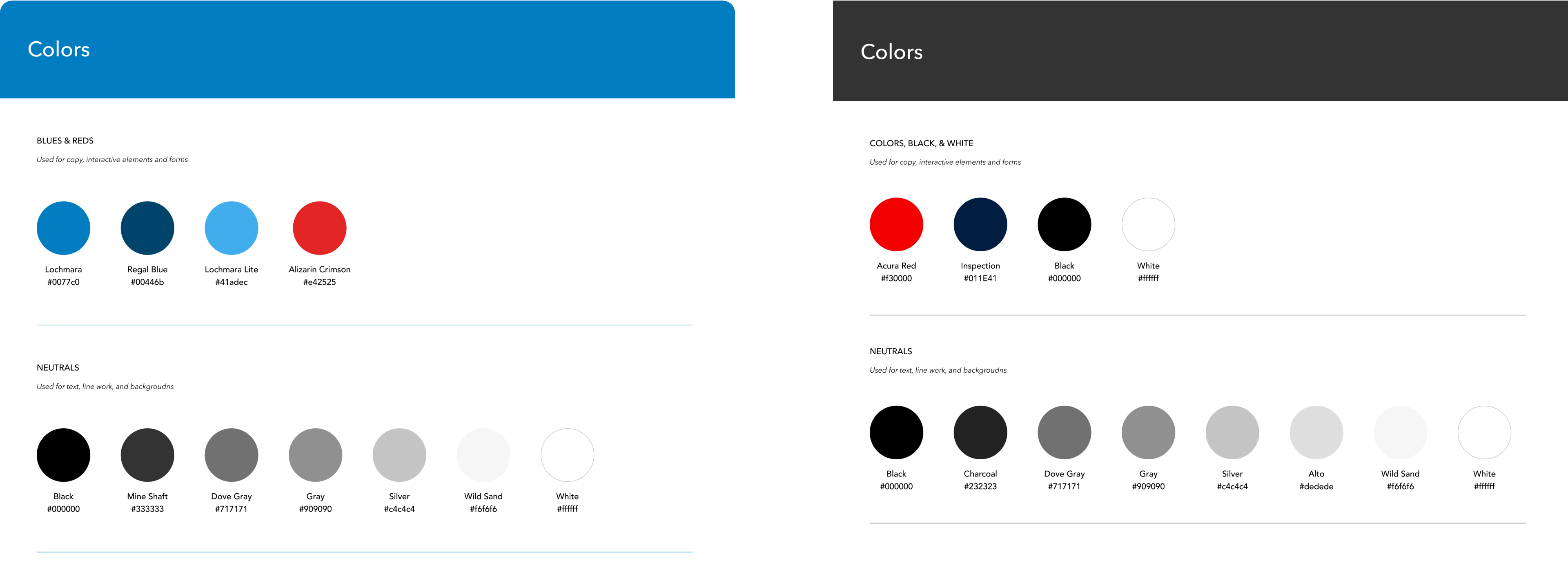
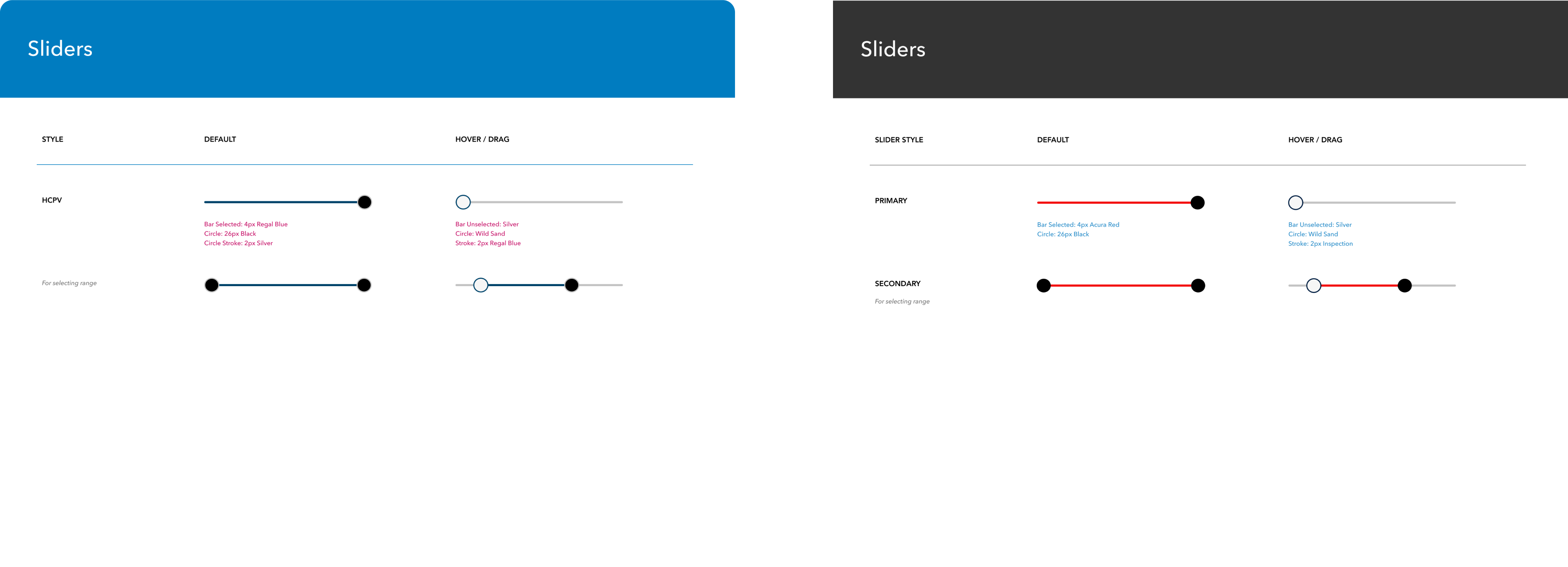
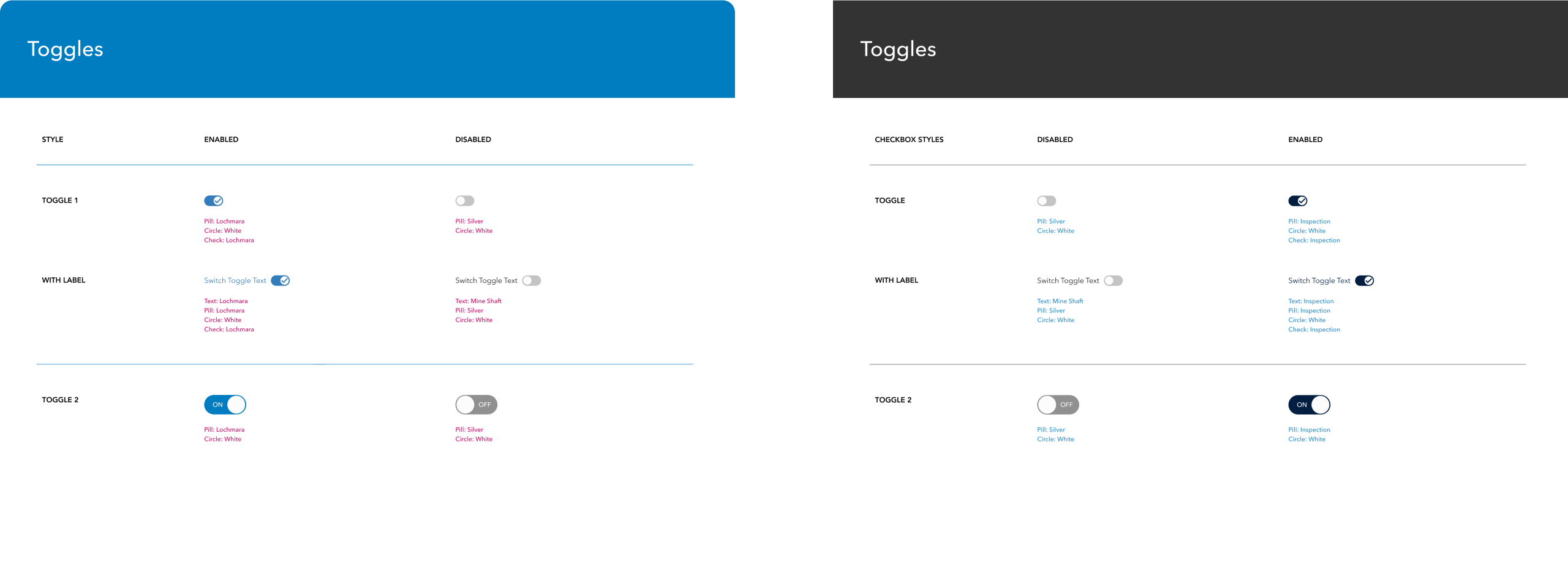
Below is an overview of font styling and UI elements that falls in line with their respective brand guidelines. Typically, Honda maintains curved edges, liberal use of blue, and bolder fonts, while Acura leans more into sharp corners, sporadic use of red, and an otherwise monochrome color palette.

MOBILE
COMPARISONS
These side by side comparisons exemplify how to clearly implement the different styling to create an on-brand experience for users.
