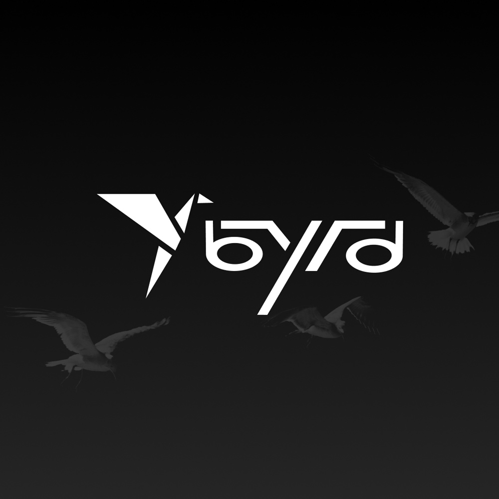
Byrd Railways
Juniper Brower, AD + UX/UI
THE
BRAND
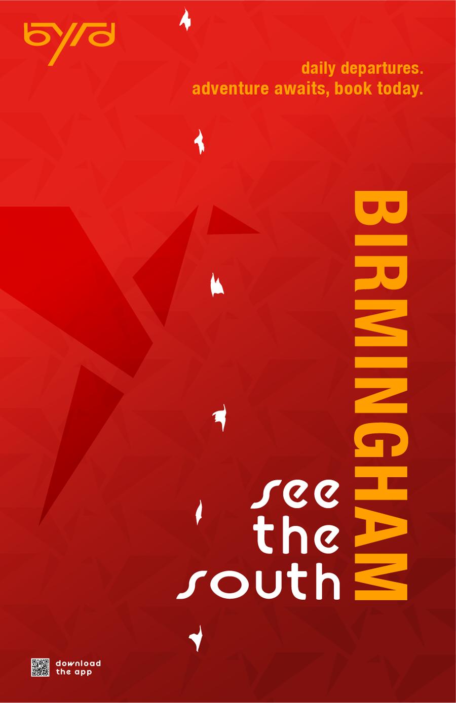
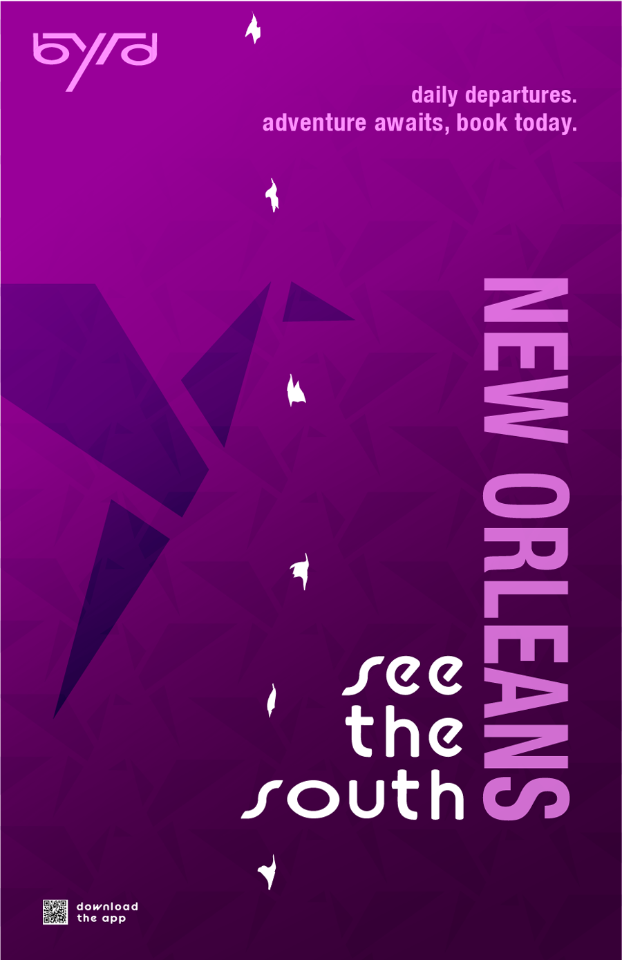
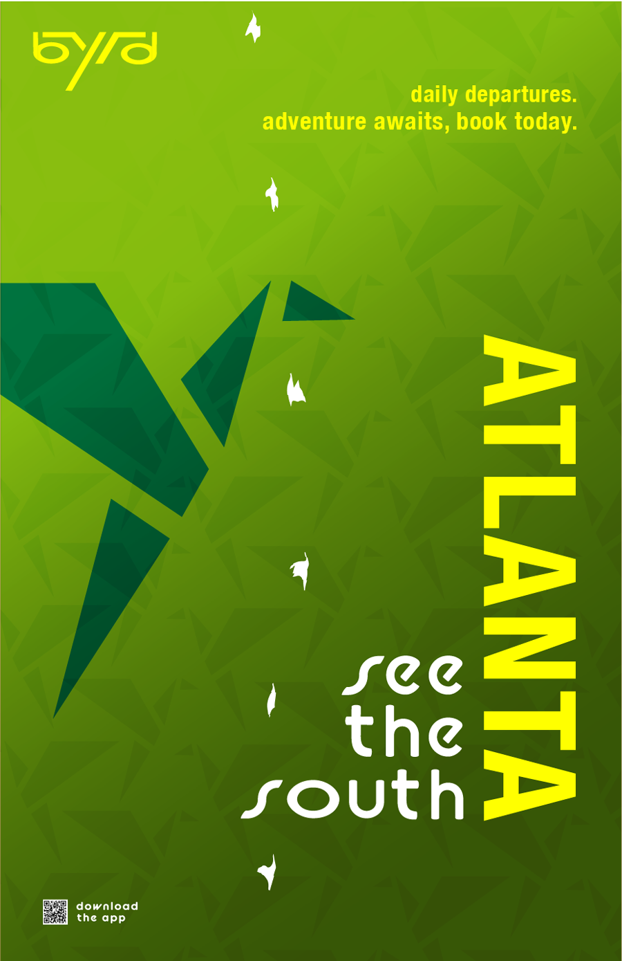
Byrd is a brand inspired by the avian species native to each of the cities from which the train will hail. New Orleans, Birmingham, and Atlanta– Each of these cities are rich with history and cultural diversity. Thus, Byrd strives to celebrate individuality and spark a sense of wanderlust as adventurers embark on a swift and reliable voyage to see the south.
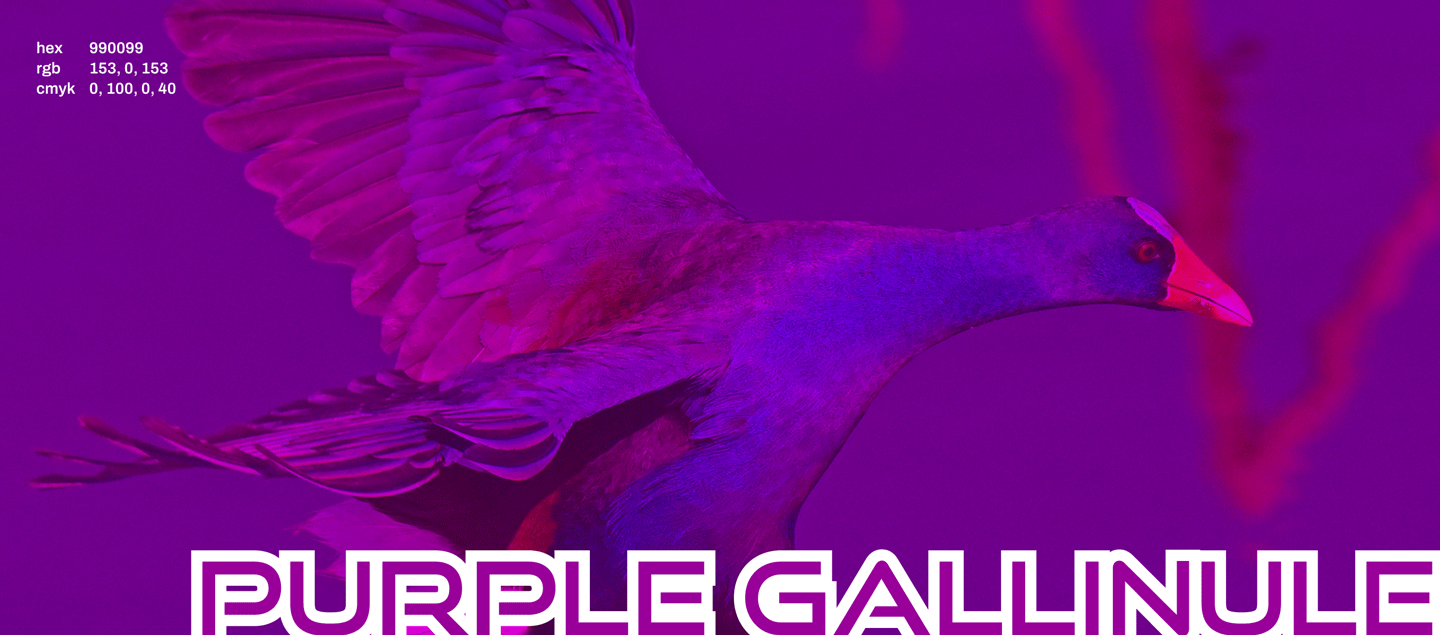
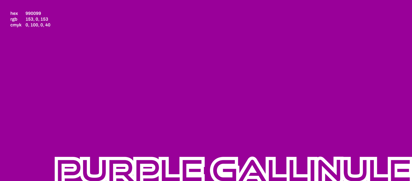
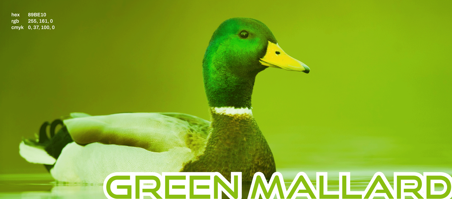
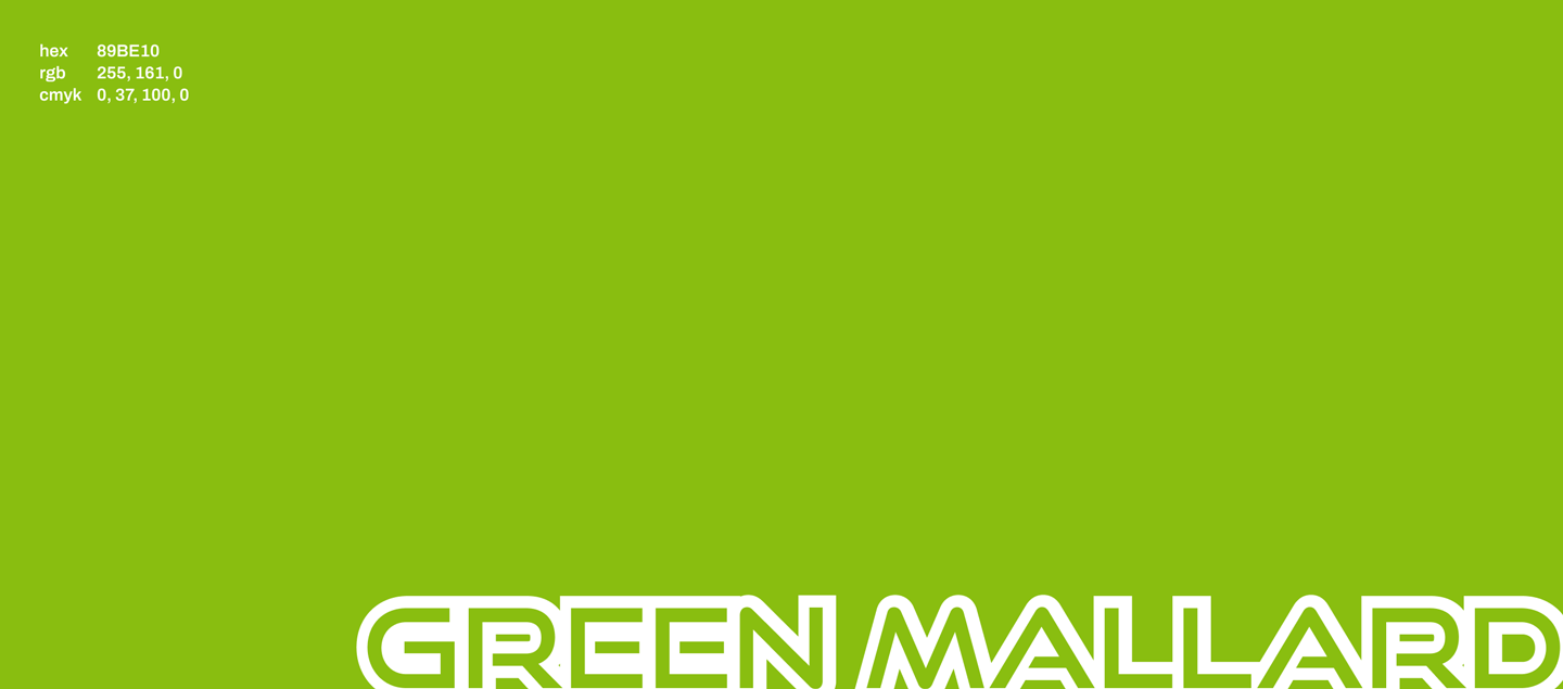
COLOR
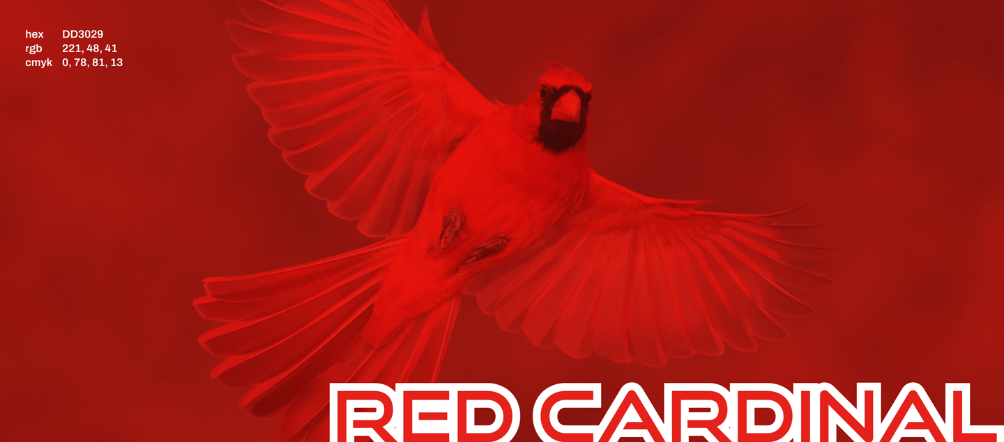
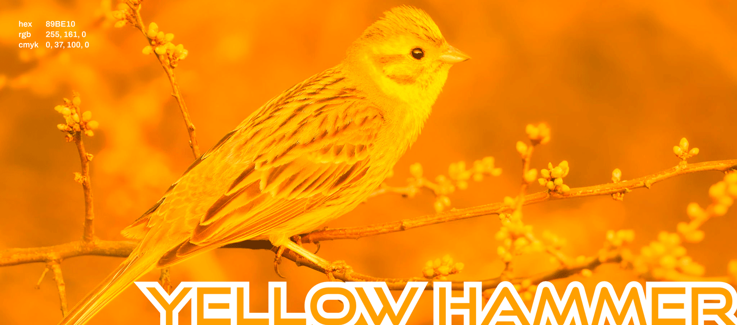
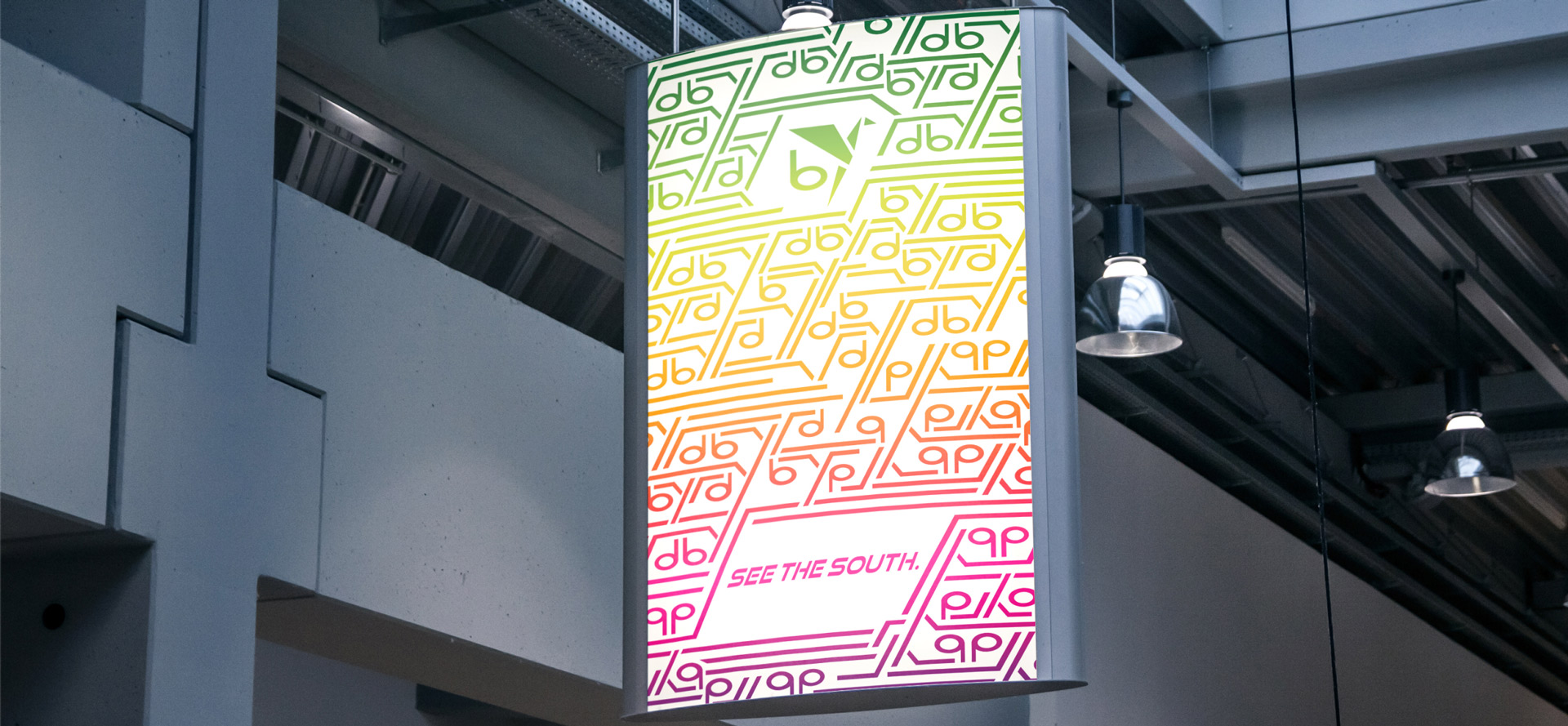
Each bold color of the palette (purple, red, yellow-orange, and green) is named after birds native to the Southeastern US, and conveys a sense of creativity and uniqueness. It emphasizes that Byrd is not just another railway brand but offers a distinctive and memorable journey. It implies that passengers will be welcomed and treated with care and attention during their travels, emphasizing the same warm hospitality the South is famously known.
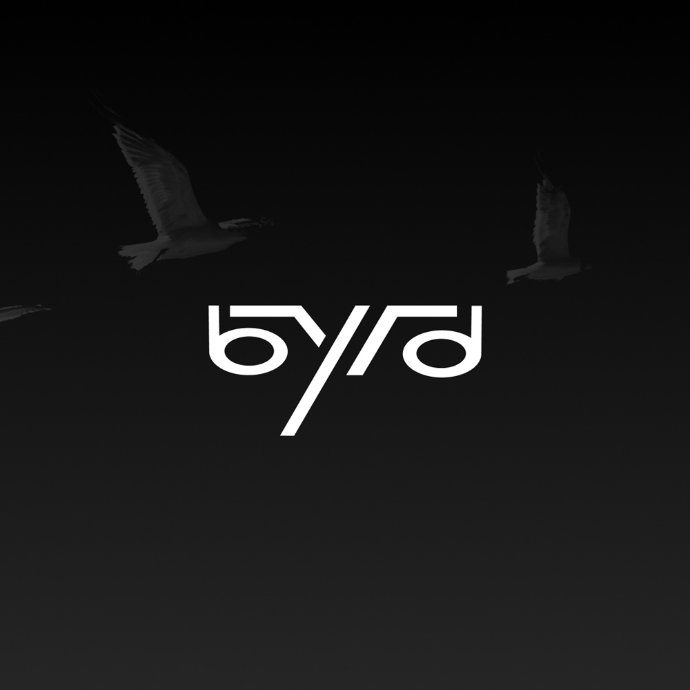
TYPOGRAPHY
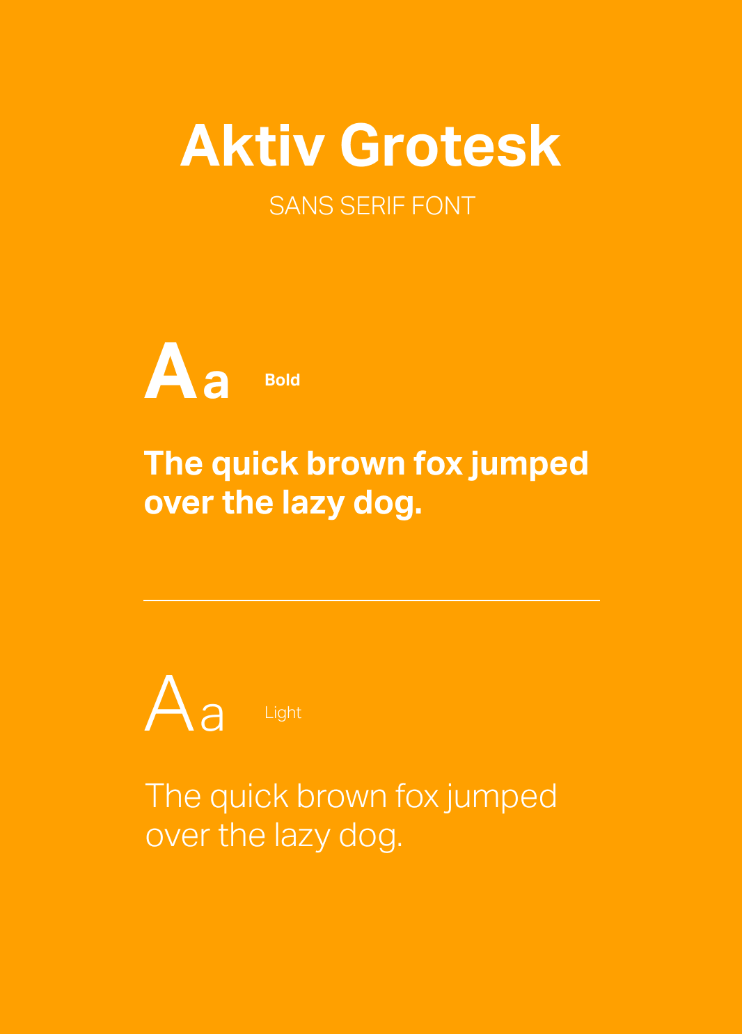
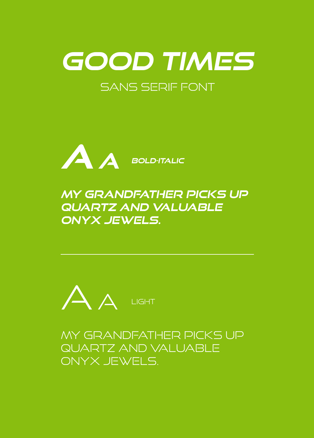
Good Times is a sleek and streamlined font showcasing Byrd as a railway at the forefront of the transportation industry with its cutting-edge technology and innovation. It’s memorable style and incredible clarity are essential to establish a transportation brand, ensuring information and messages are easily understood by passengers and public. Paired with Aktiv Grotesk for body copy of written materials, typography will sure to be clean and clear to get everyone where they need to go.
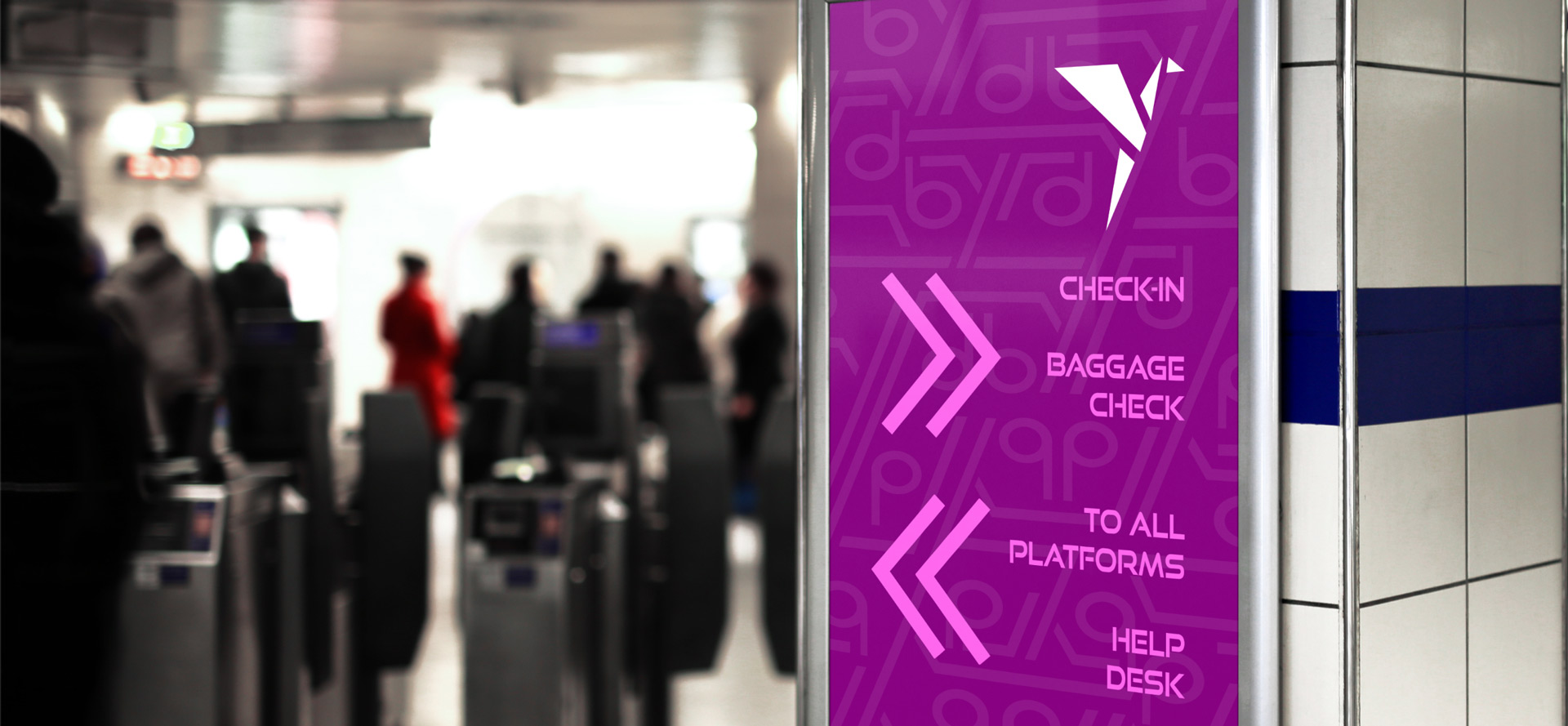
SIGNAGE
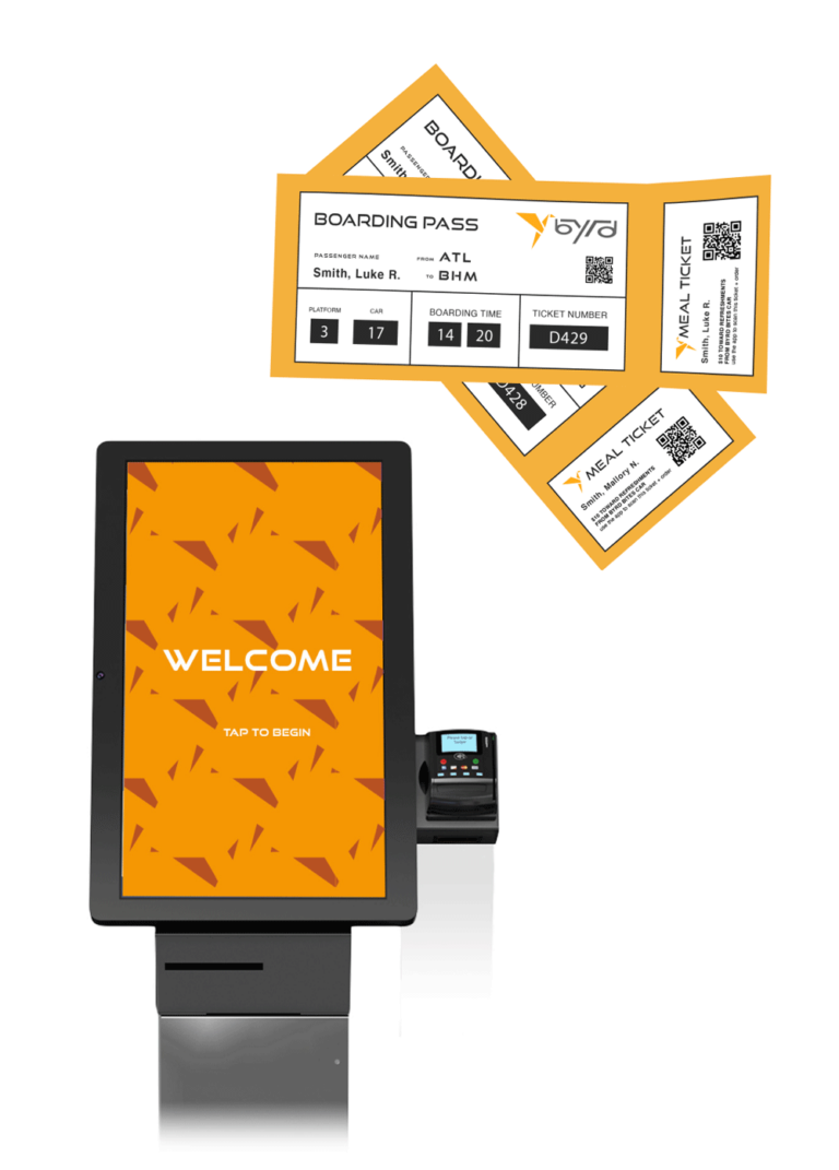
CHECK-IN
Welcome kiosks are headlined with Byrd’s signature “Good Times” font. The pattern shown in the background is created by spacing out the logo components. It is versatile design that could be used for upholstery, clothing, signage, packaging, and more.
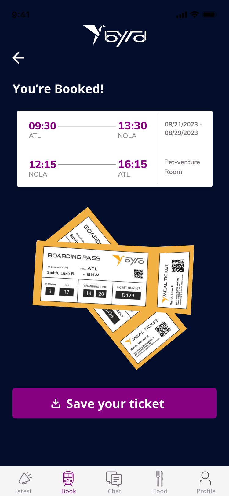
Upon check-in, passengers will receive their boarding pass. Much like checking in for a flight, they may proceed to the customer service counter to check their baggage to ensure maximum security of their belongings. This allows them to move between cars feeling light as a feather.
FIND WHO YOU’RE
LOOKING FOR
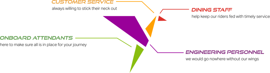
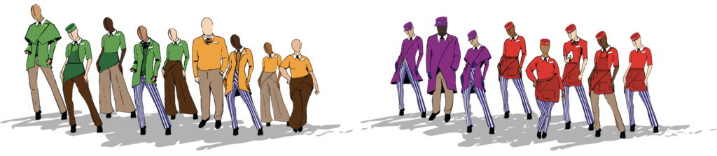
When envisioning the uniforms that would be worn by Byrd employees, diversity and inclusion topped the list of priorities. Staff should be encouraged to express themselves through more than a singular polo at work; with more than thirty-five combination options, their only requirement is to wear the color of their team role. These bold colors are sure to stand out in the crowd and ensure customers can find exactly who they need.
ONBOARD
MEALS
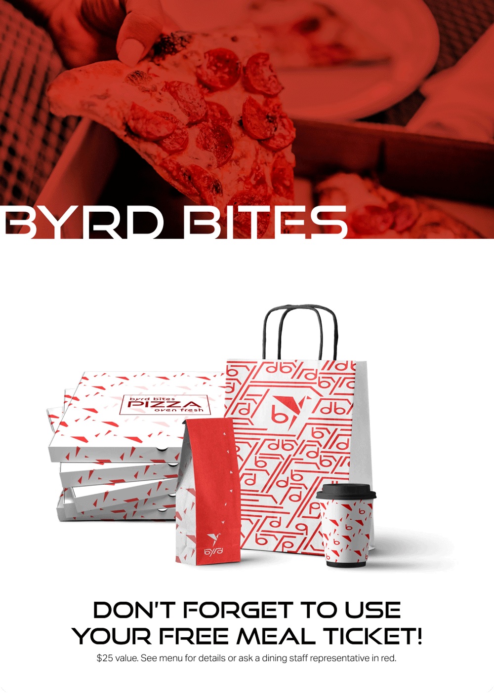
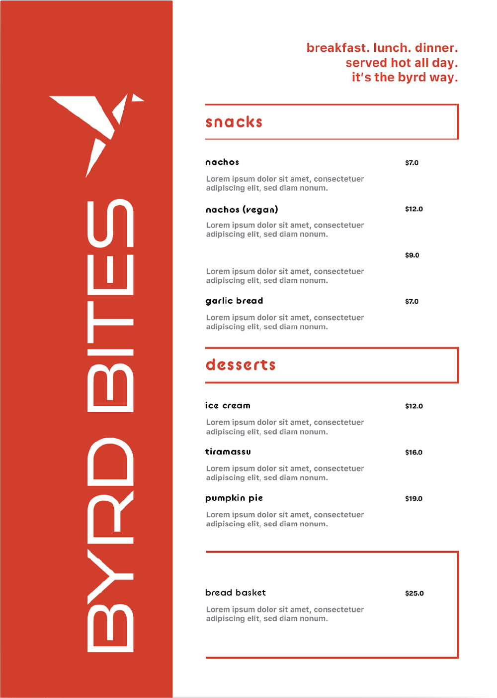
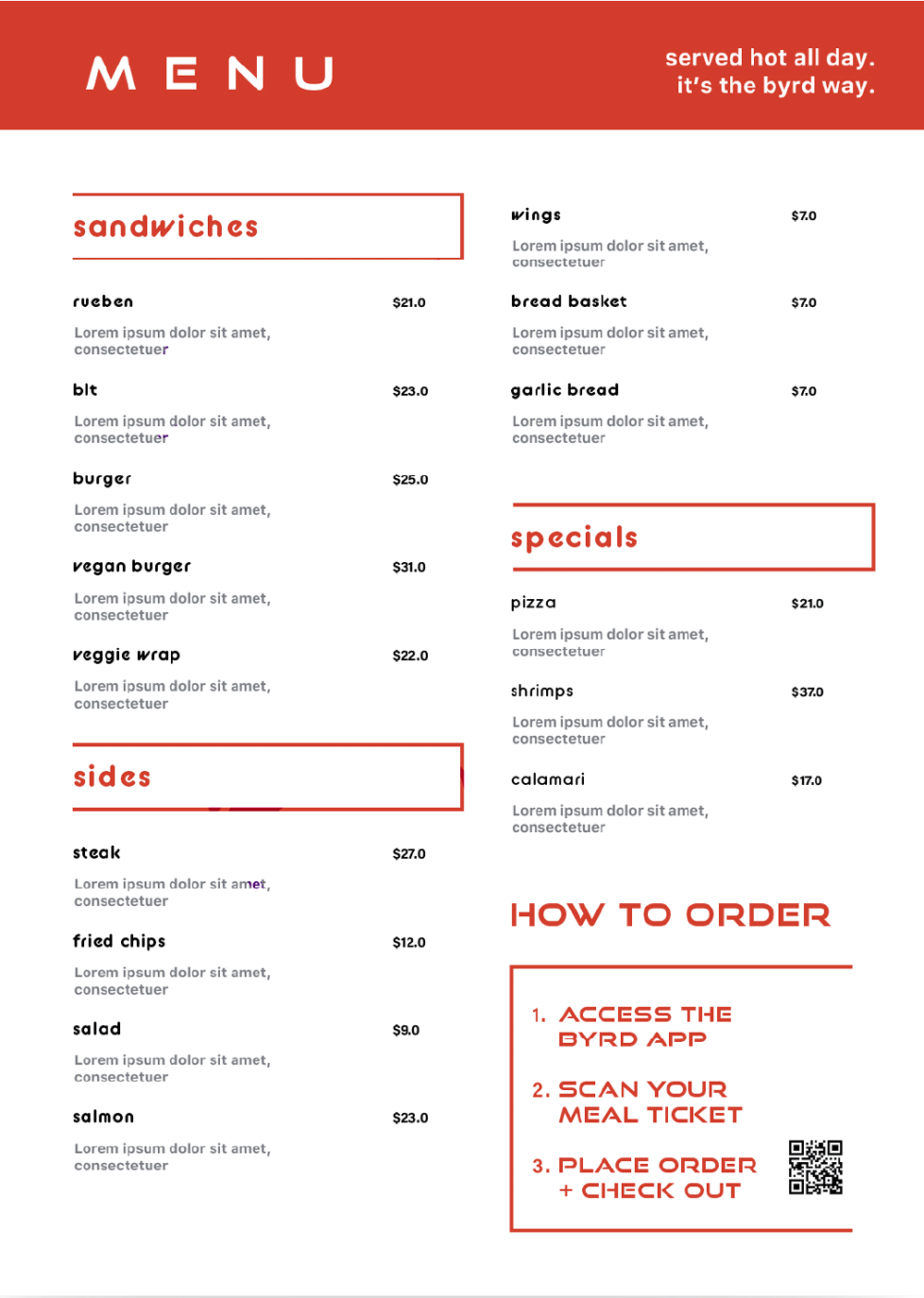
Each boarding pass includes a meal ticket redeemable for up to $20 worth of food or beverages from our kitchen. Byrd understands the necessity of fueling your travel. That is why we include this voucher in the cost of your ticket. The menu caters to most dietary restrictions. Dairy-free, Glueten-free, and Plant-based options are available.
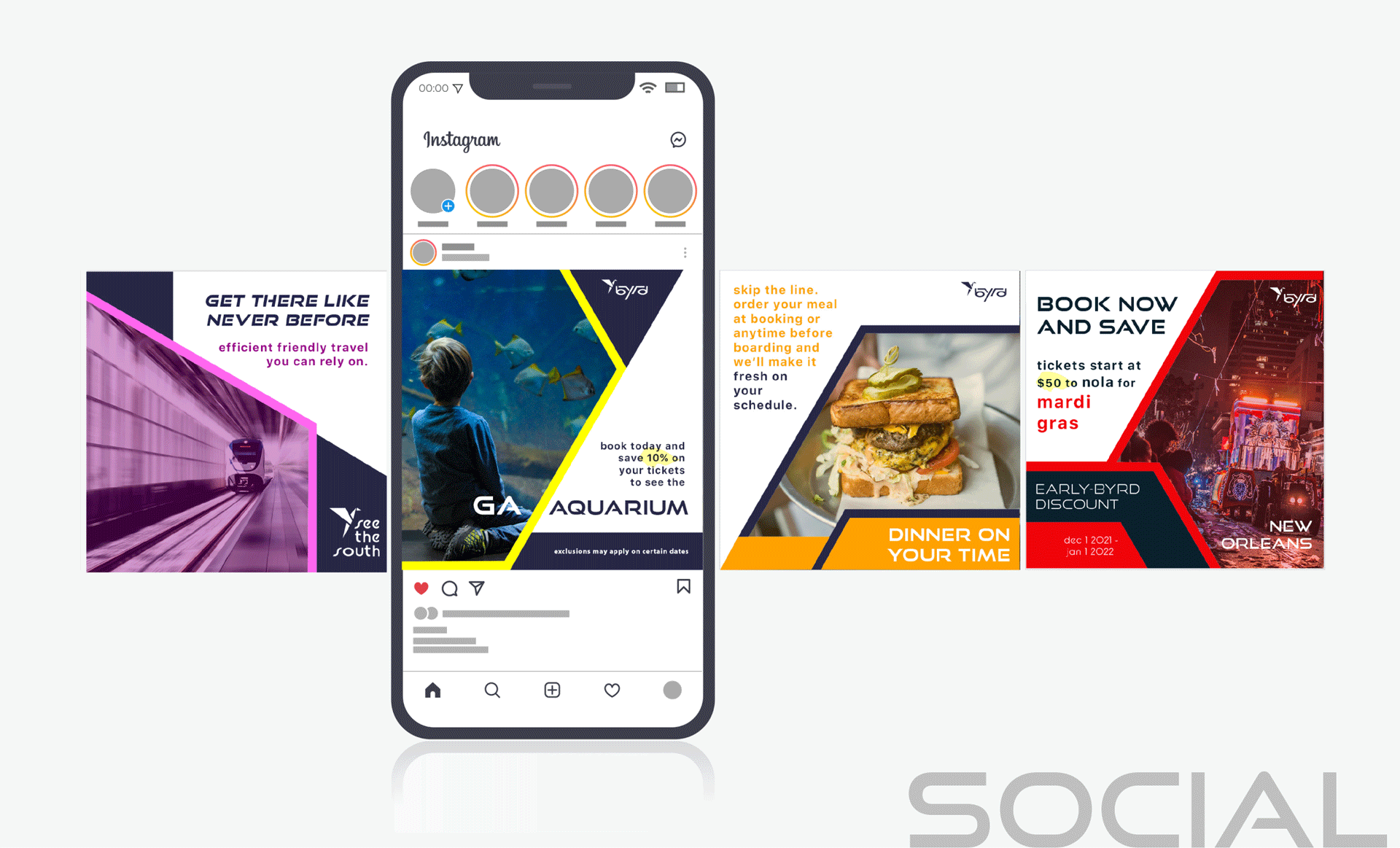
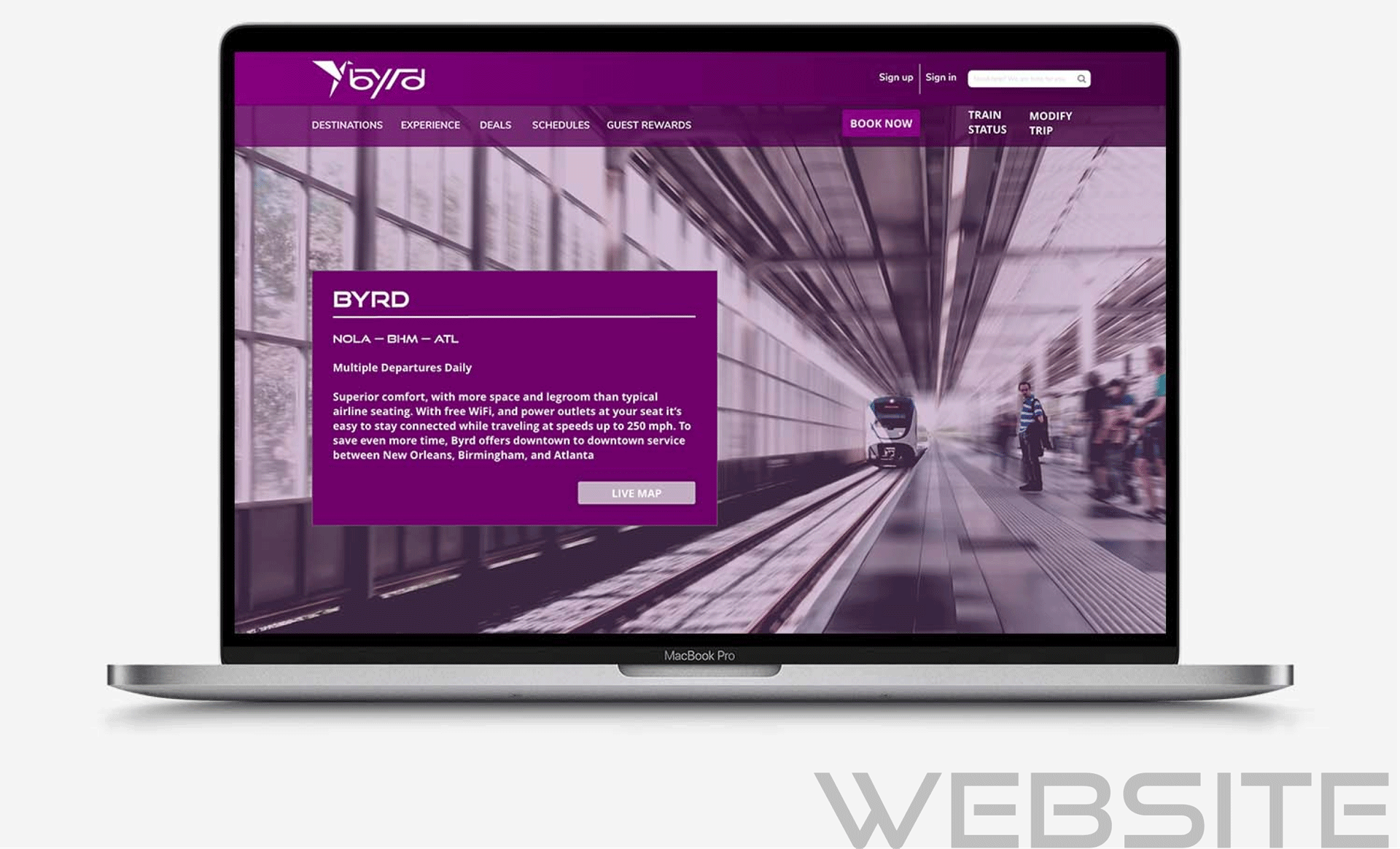
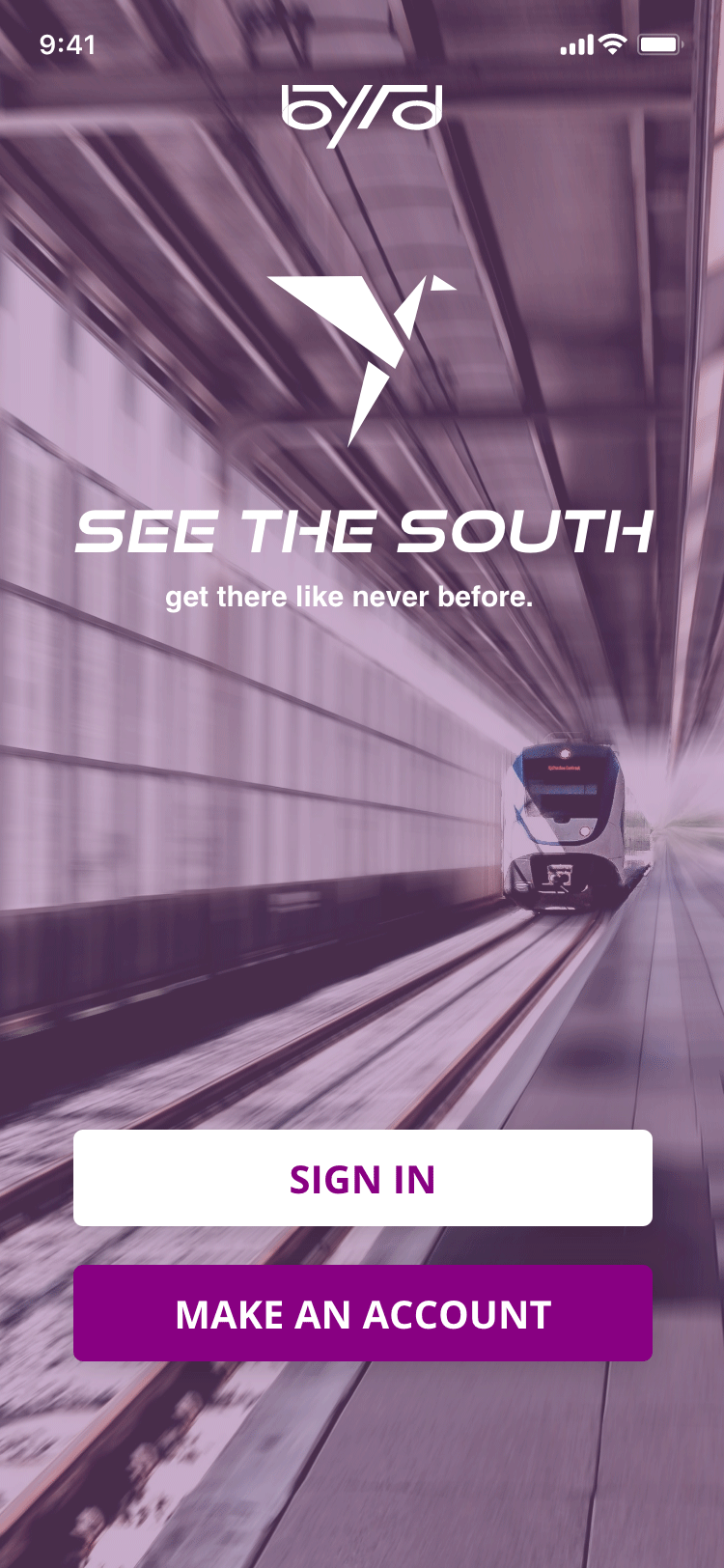
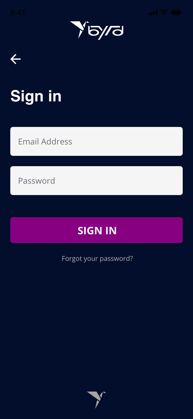
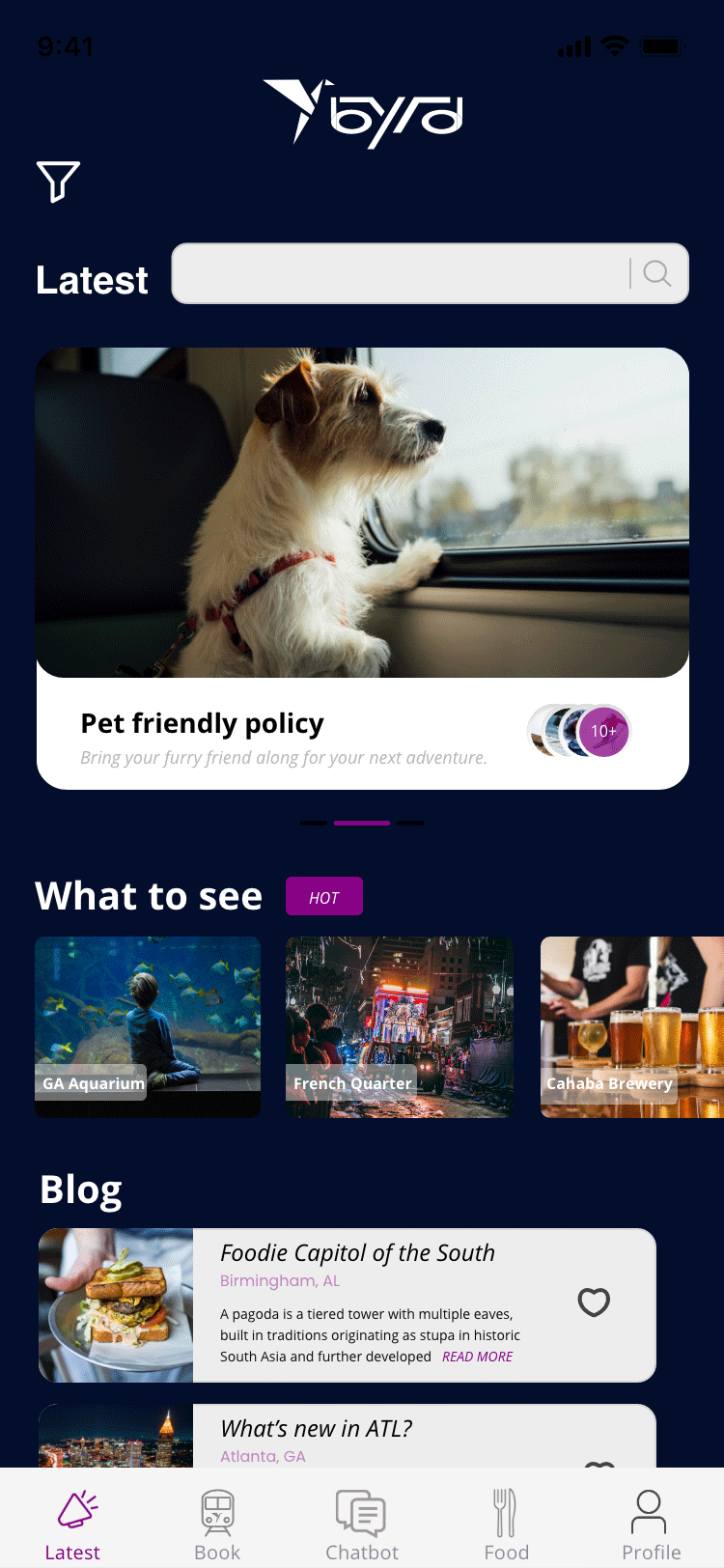
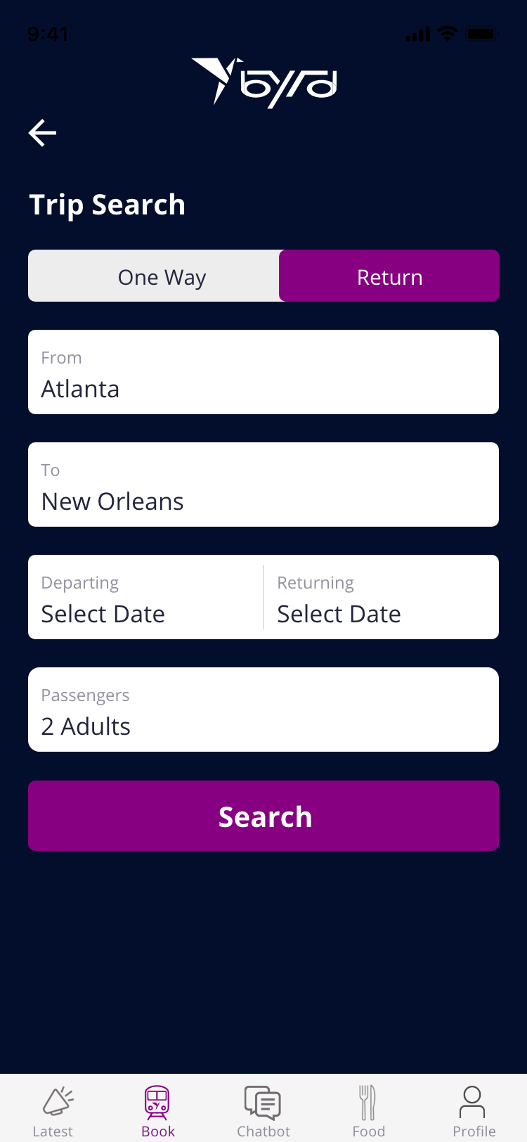
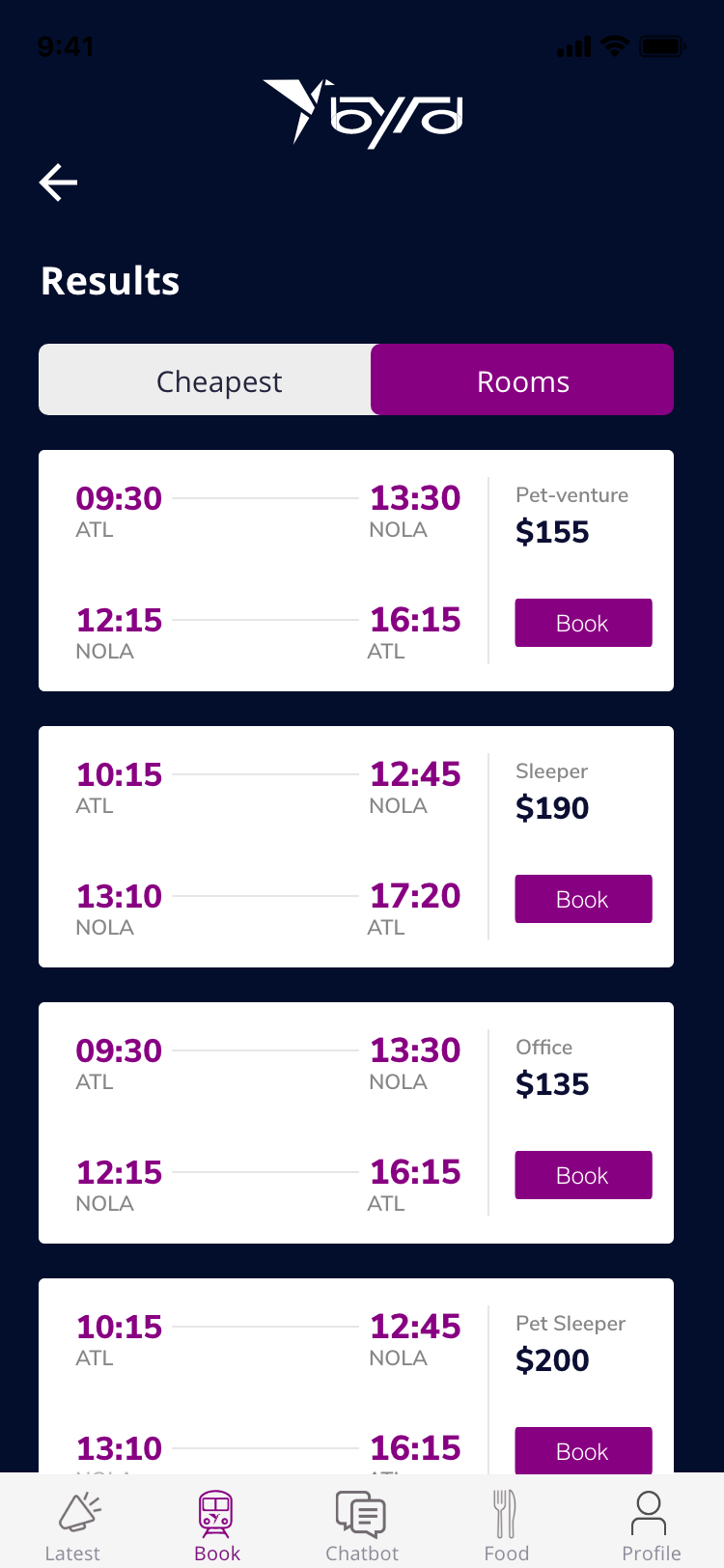
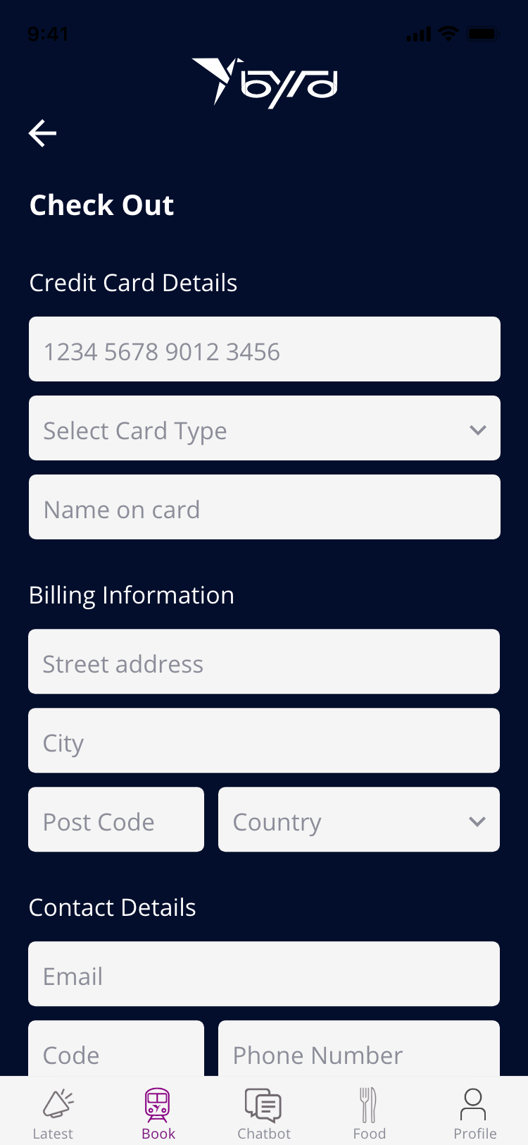
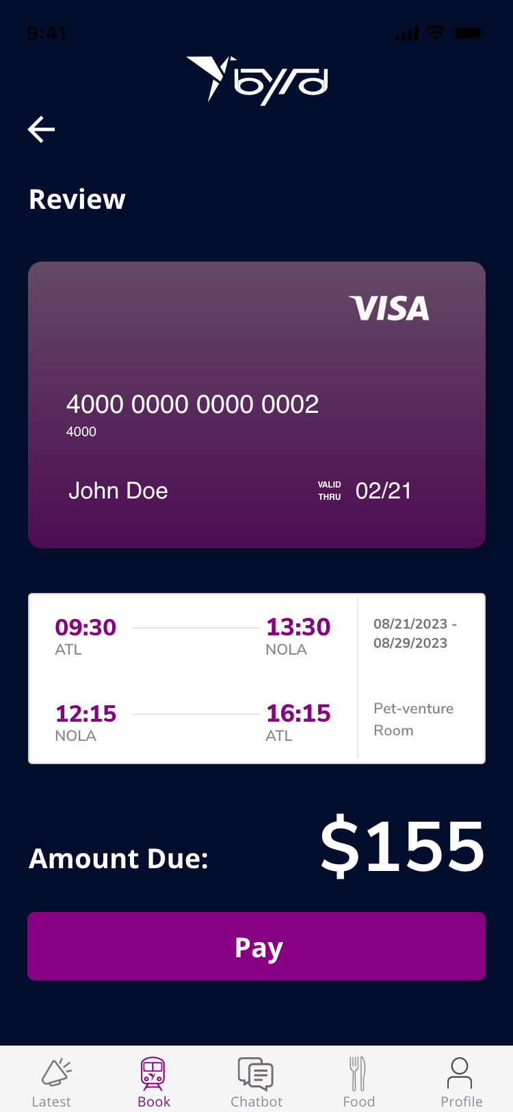
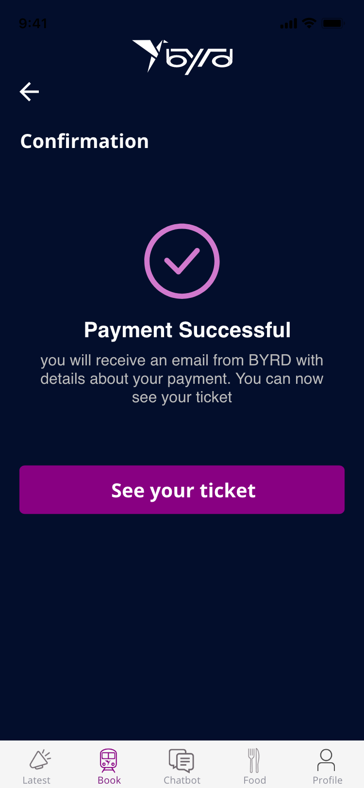
THE APP
The Byrd app is the central hub for exploring destinations, booking tickets, and ordering on-board meals. Check out the booking flow below!