
Logo Black Logo White
  • THE WORK
    • Résumé
    • LeftMark Studio
      • SouthCoast
      • Eat Sleep Nerd
    • RPA Advertising
      • RPA Pride
      • RPA Newsletter
      • RPA.com
      • Acura
      • Honda Certified Pre-Owned
    • The Book Shop
      • IKEA
      • Bumble
    • Bloom Studio
      • Birmingham Rugby
      • Byrd Railways
  • CONNECT
    • on Instagram
    • via LinkedIn
    • through Email
    • with Free Online Resources
Menu

Eat Sleep Nerd

Art Direction // Brand Identity
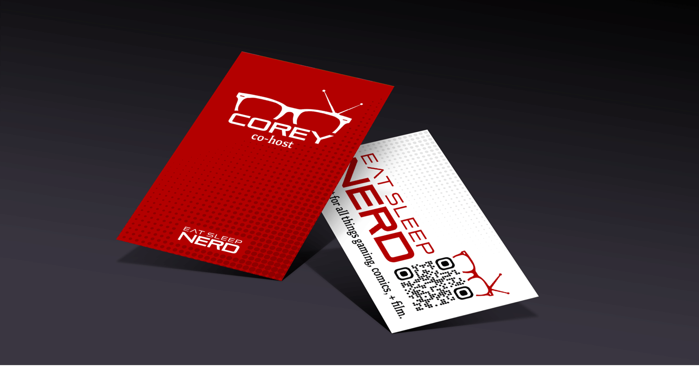
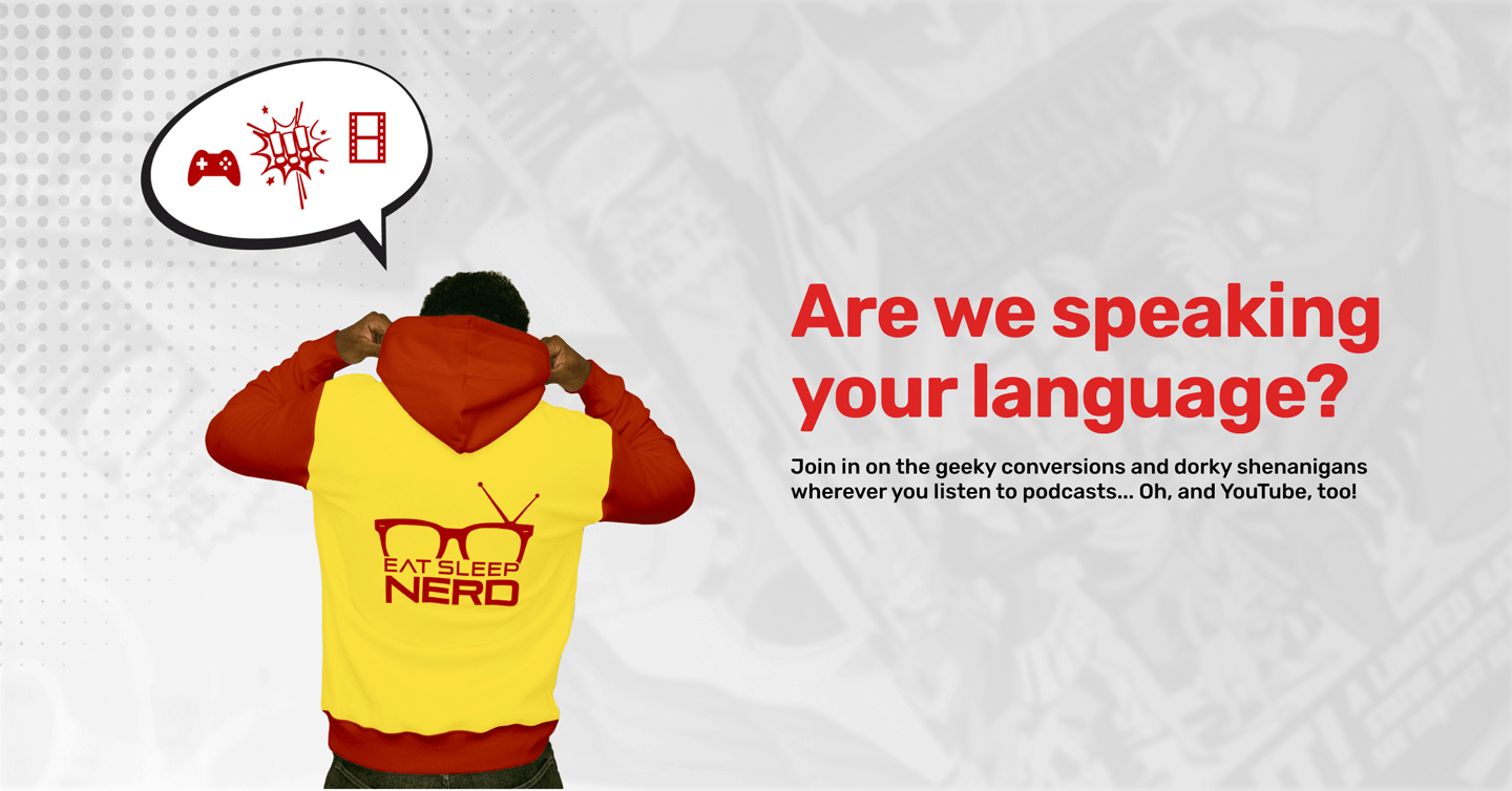
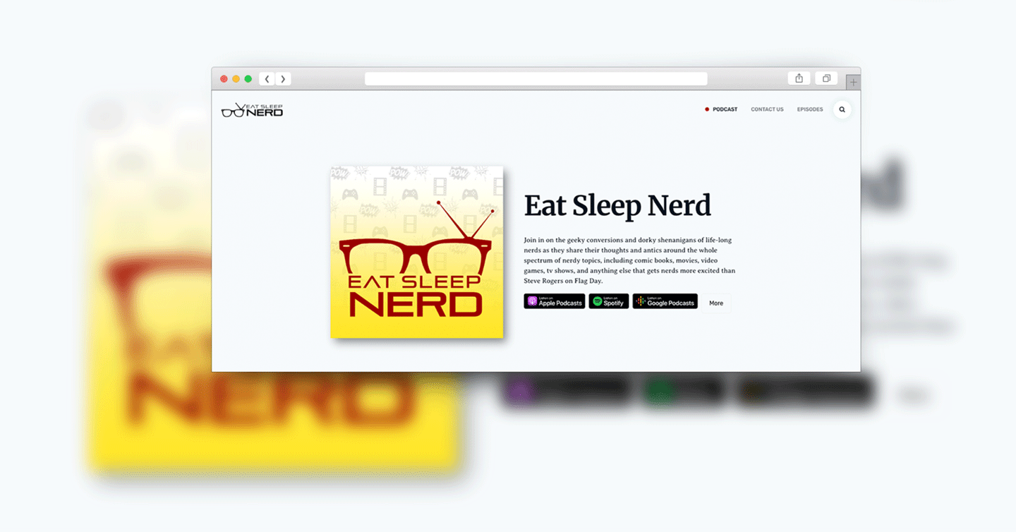
When the hosts approached me to craft their brand, we worked together to make Eat Sleep Nerd the best place to let your geek flag fly. This podcast is packed full of geeky conversions and dorky shenanigans hosted by life-long nerds tackling anything from blockbuster movies and binge-worthy TV series to the latest video game releases, they keep their content fresh and diverse, ensuring there's something for every fan.
View Project

Juniper Brower, AD + UX

THE
BRAND

Given there are infinite subjects one could “nerd” about, it was a priority that it be clear the brand communicates its centering on film, TV, and gaming. Thus their classic geek glasses with retro tv antennas became their mark. It pairs with a wide, futuristic font that emphasizes NERD as the biggest and boldest in its title. Like many nerds we know and love, these hosts live and breathe the stories that unfold on the screen and in the virtual world. Thus, Eat Sleep Nerd was born.
COLOR

Yellow and red are energetic colors that can convey a sense of liveliness and dynamism, suggesting that the podcast is engaging and full of life. The combination of bright and bold colors with the more subdued gray and black can signifies a balance between youthful enthusiasm and maturity. It suggests that the podcast offers a well-rounded perspective on the topics it covers.

TYPOGRAPHY

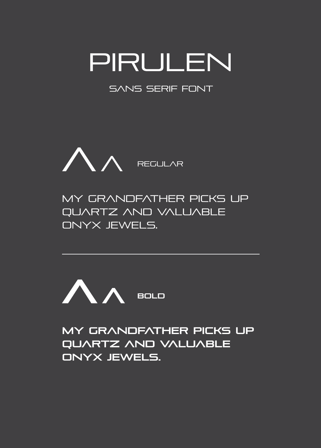
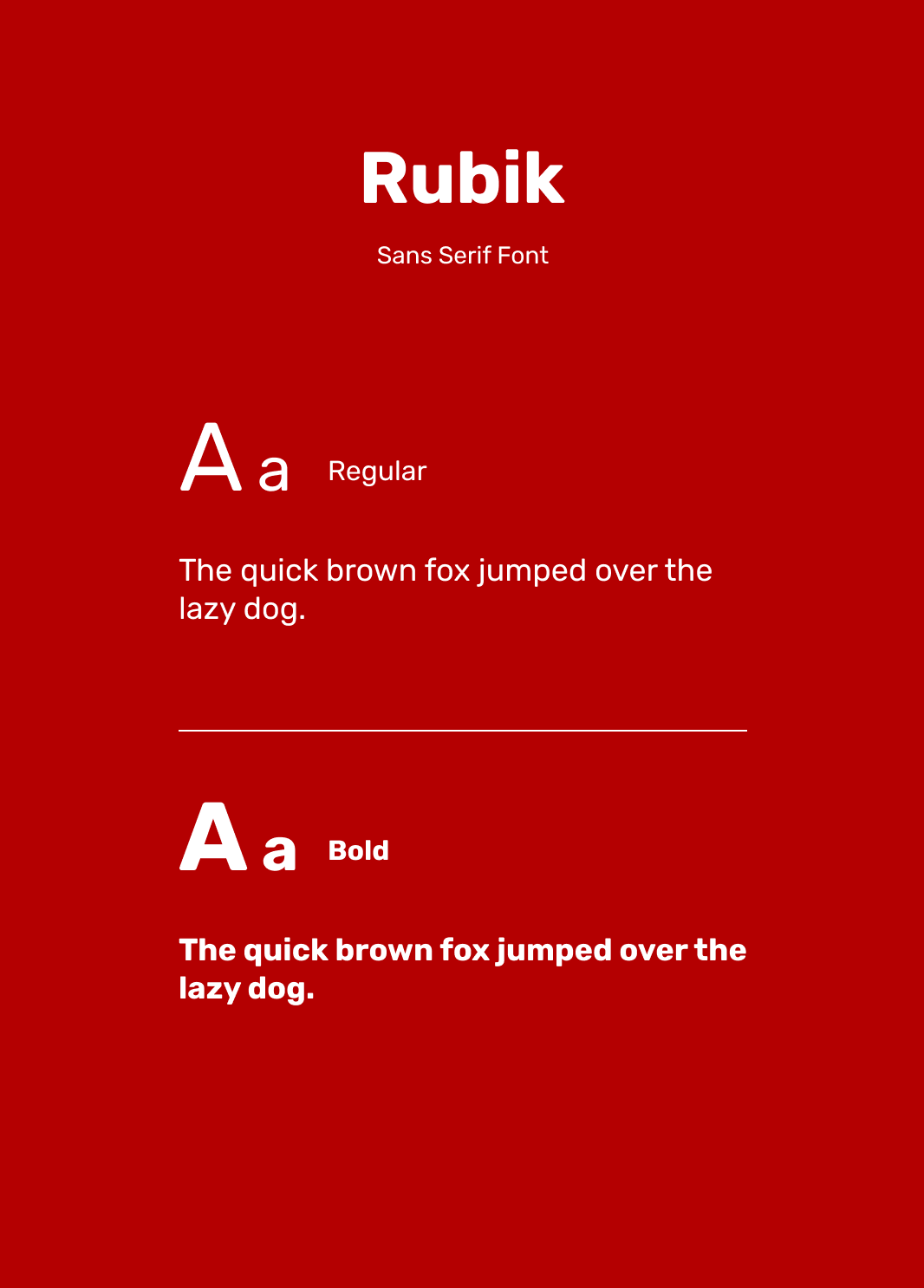
Pirulen has a Sci-Fi and somewhat tech-oriented appearance. This aligns well with the tech-savvy and geeky culture. While distinctive in appearance, Pirulen not overly stylized or ornate, ensuring that it strikes a balance between uniqueness and readability. This font can serve as a visual focal point, drawing the viewer’s eye to important elements, while Rubik can be used for primary content, providing a structured and organized look for the brand.

0
SouthCoast
Next Project
Back Top
2023 © Juniper Brower. All rights reserved.
Scroll Up